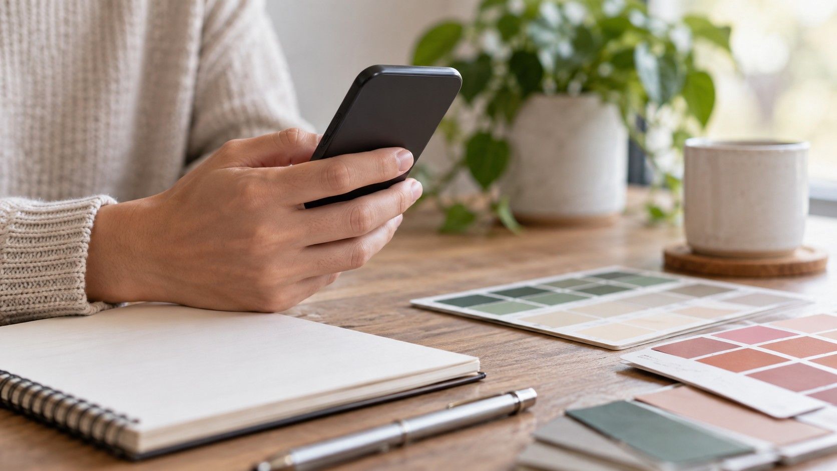
A color analysis app can turn a casual selfie into a proposed season, undertone, and palette in seconds. That speed is useful, but it is easy to mistake a neat result for a final answer. The phone has already interpreted the light, the app has made assumptions from pixels, and your face may be carrying makeup, a tan, or reflected color from the room. Treat the result as a hypothesis that deserves a real-world test.
What a color analysis app is estimating from a photo
Most tools look for relationships among apparent skin color, hair color, eye area, and contrast. They may group those relationships into warm, cool, neutral, bright, muted, light, or deep categories, then map the group to a seasonal color analysis label. That can be a sensible shortcut, particularly when an app shows its reasoning as comparisons rather than just announcing a season. It still cannot know whether the camera warmed the image, whether your hair is dyed, or which clothing colors make you feel comfortable.
Photo processing is the hidden variable. Phones may smooth skin, brighten shadows, and correct white balance differently from one camera to another. A warm living-room lamp can make neutral skin look golden; a blue window can make it look pink or gray. The app receives that processed image, not a laboratory sample. A result that changes radically when you upload a second photo is not proof that your coloring is mysterious. It is evidence that the input needs more control.
Prepare a photo that gives the tool a fair chance
Use indirect daylight beside a window, facing the light rather than putting it behind you. Avoid golden-hour sun, overhead bathroom bulbs, ring lights, and rooms with a bright colored wall. A plain pale background helps because a red sweater, green curtain, or yellow wall can reflect onto the face and influence both your eyes and the camera. Turn off beauty filters, portrait retouching, and display warmth before choosing the image.
A bare face or very light makeup is best for this purpose. Foundation, bronzer, and color-correcting concealer can make a photo more polished while hiding the surface cues an app tries to measure. Tie hair away from the cheeks if it is long and take several rear-camera photos from a modest distance. The goal is a clear record, not a flattering close-up. Save two or three images from the same setup so you can see whether the result is repeatable.
Ask better questions than “what season am I?”
A useful online color analysis result should help you make a comparison: softer versus clearer colors, warm ivory versus cool white, deep navy versus black. Be cautious when a tool gives a very specific label but no explanation, no palette variation, and no acknowledgement that people can sit near a border. Seasonal names are shorthand. They are helpful if they lead to better clothing tests; they are not a diagnosis that requires you to replace your closet.
Look at the output for patterns rather than an absolute verdict. Does it repeatedly suggest muted colors? Does it describe your contrast as low, medium, or high? Do its recommended blues, reds, and neutrals share a common quality? Those observations are more portable than a single named season. If an app says you are cool but its best-looking examples are all grayish and medium-depth, the softness and depth may matter more in practice than the cool label alone.
| App result | Useful interpretation | Next real-world check |
|---|---|---|
| Same season appears in several daylight photos | A promising starting direction | Test two suggested near-face colors in fabric |
| Different seasons appear with each upload | Lighting or processing is dominating | Retake photos in one controlled setup |
| Palette is bright but your face looks overwhelmed | Saturation may be overstated | Compare clear and muted versions of each hue |
| Tool recommends only one metal | A limited visual guess | Compare silver, soft gold, and mixed metal in daylight |
Compare outputs instead of trusting the first confident answer
Run the same carefully prepared photo through more than one color analysis online tool if you are curious, but do not average the labels as though they were votes. Compare the actual palette qualities. One tool may call you Soft Summer and another may call you Soft Autumn; both may be noticing muted contrast. That shared feature is worth testing. If the recommendations disagree between bright winter colors and dusty summer colors, look at your source image before assuming the tools have uncovered two personalities.
Keep a simple note of each result: photo conditions, suggested direction, and the three colors you tested. After a week, you will have evidence from your own mirrors and daylight rather than a stack of screenshots. This also makes it easier to notice when an app is reacting to a particular hair color, tan, or lipstick. Repeatability matters more than novelty. A useful tool should point you toward a pattern you can see again outside the app.
Check privacy and image handling before uploading your face
A face photo is personal data, even when you are only asking what colour suits my skin tone. Before uploading, read the visible privacy information and look for clear choices about storage, deletion, and whether images are used to improve a system. Do not assume an app is harmless because it offers a playful palette. If the terms are vague or you cannot tell how to remove a photo, use an image that does not reveal your home, workplace, documents, or other people.
Crop the image to head and shoulders if that still gives the tool enough information. Remove location data from the file when your phone offers that option, and avoid uploading a photo with children or recognizable interiors. A color recommendation is not worth oversharing. You can also use a local mirror comparison and color fabrics when you prefer not to upload at all; the app is a convenience, not a requirement for learning your best directions.
Validate a digital palette in daylight before you buy anything
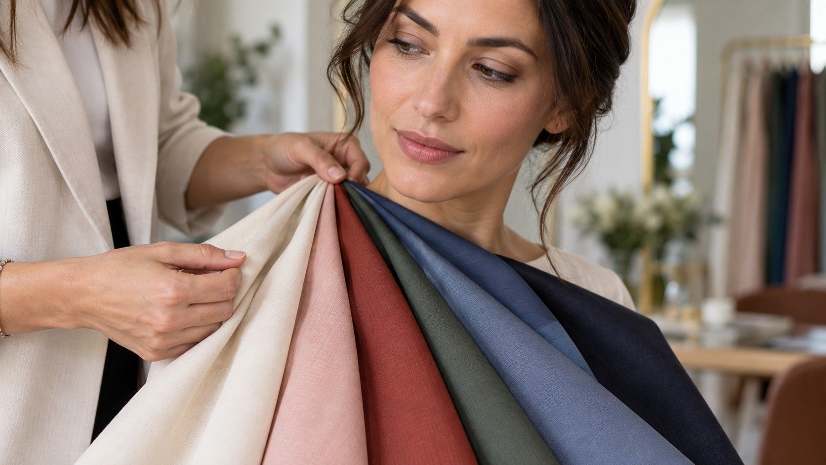
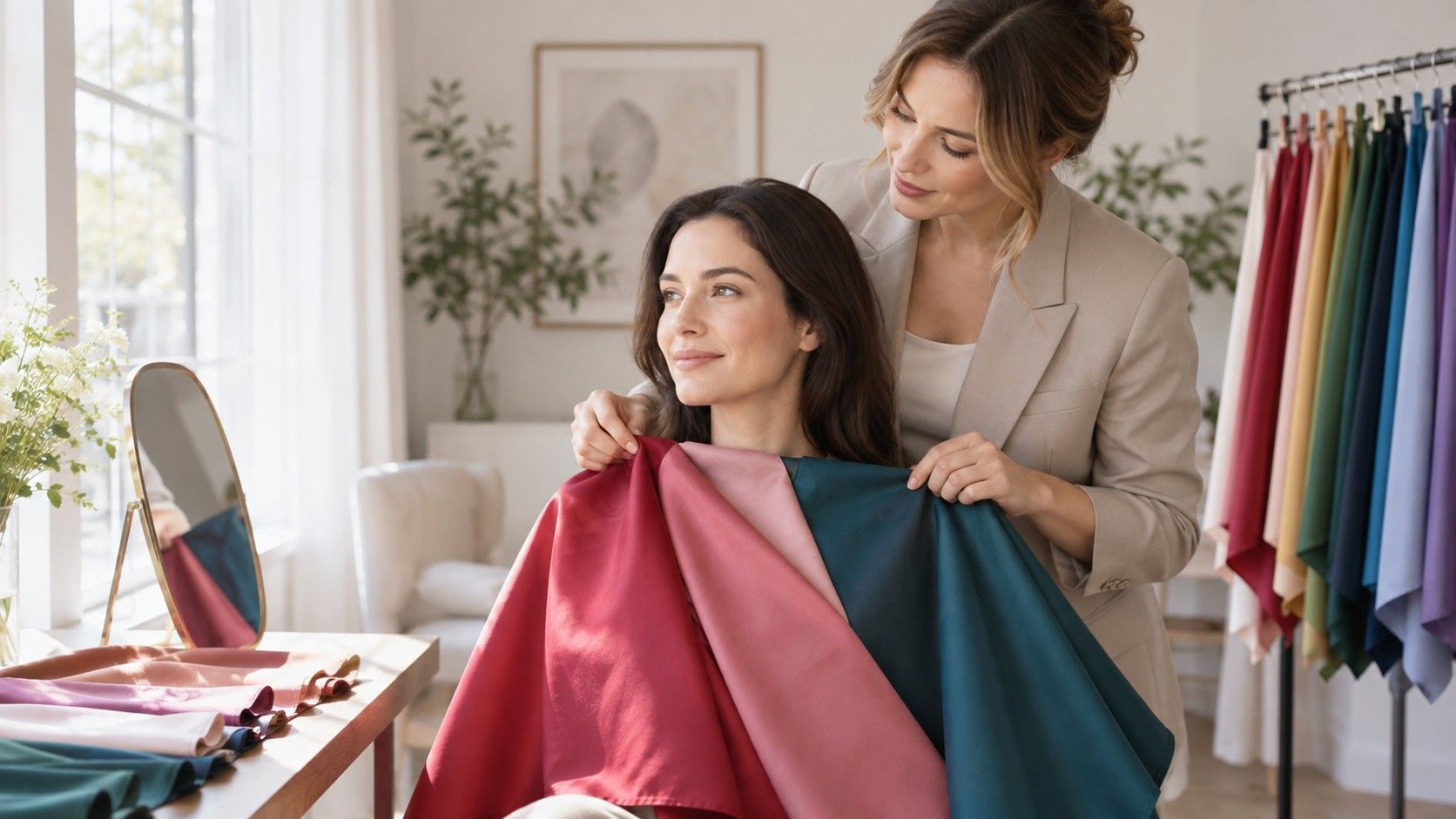
Choose four colors from the proposed palette: two neutrals and two accents. Find close matches in clothes you already own, paint chips, fabric scraps, or a shop that allows you to hold garments up by a window. Compare each with a plausible opposite: soft navy against black, dusty rose against coral, cool white against cream. Watch the under-eye area, the jaw, and the overall clarity of the face. The better color generally reduces visual noise rather than simply looking fashionable on the hanger.
Take photographs of the comparisons from the same spot and view them later on a neutral screen. If the palette works repeatedly in morning light, ordinary indoor light, and photos without filters, it has earned a place in your wardrobe decisions. If a suggested color needs a full face of makeup or perfect lighting to behave, move it to accessories. An app has succeeded when it helps you test more intelligently, not when it persuades you to accept a palette you cannot see working.
Keep the result flexible as your look and life change
Hair dye, a tan, glasses, and changing contrast can all alter the colors that feel easiest near your face. Your underlying undertone may stay stable while the best depth or saturation shifts. Revisit a color analysis app after a major change if you enjoy the experiment, but keep the same controlled photo conditions. That makes the comparison meaningful instead of turning every new result into a closet emergency.
The most durable personal palette is a small collection of colors you have worn successfully in normal life. Use technology to discover possibilities, then let daylight, fabric, and your own repeated observations decide. That approach leaves room for seasonal systems without handing a phone the final say over your clothes.