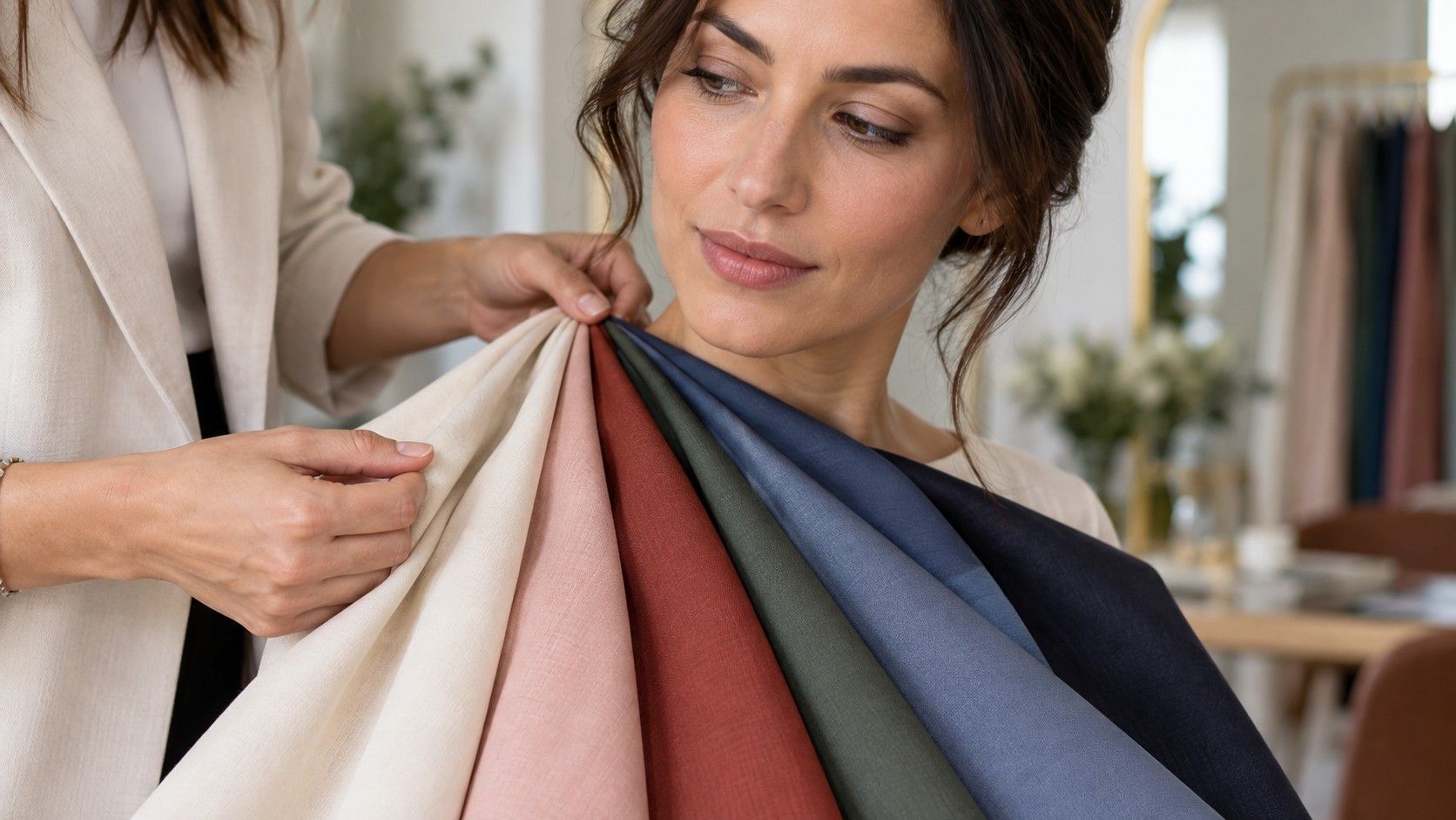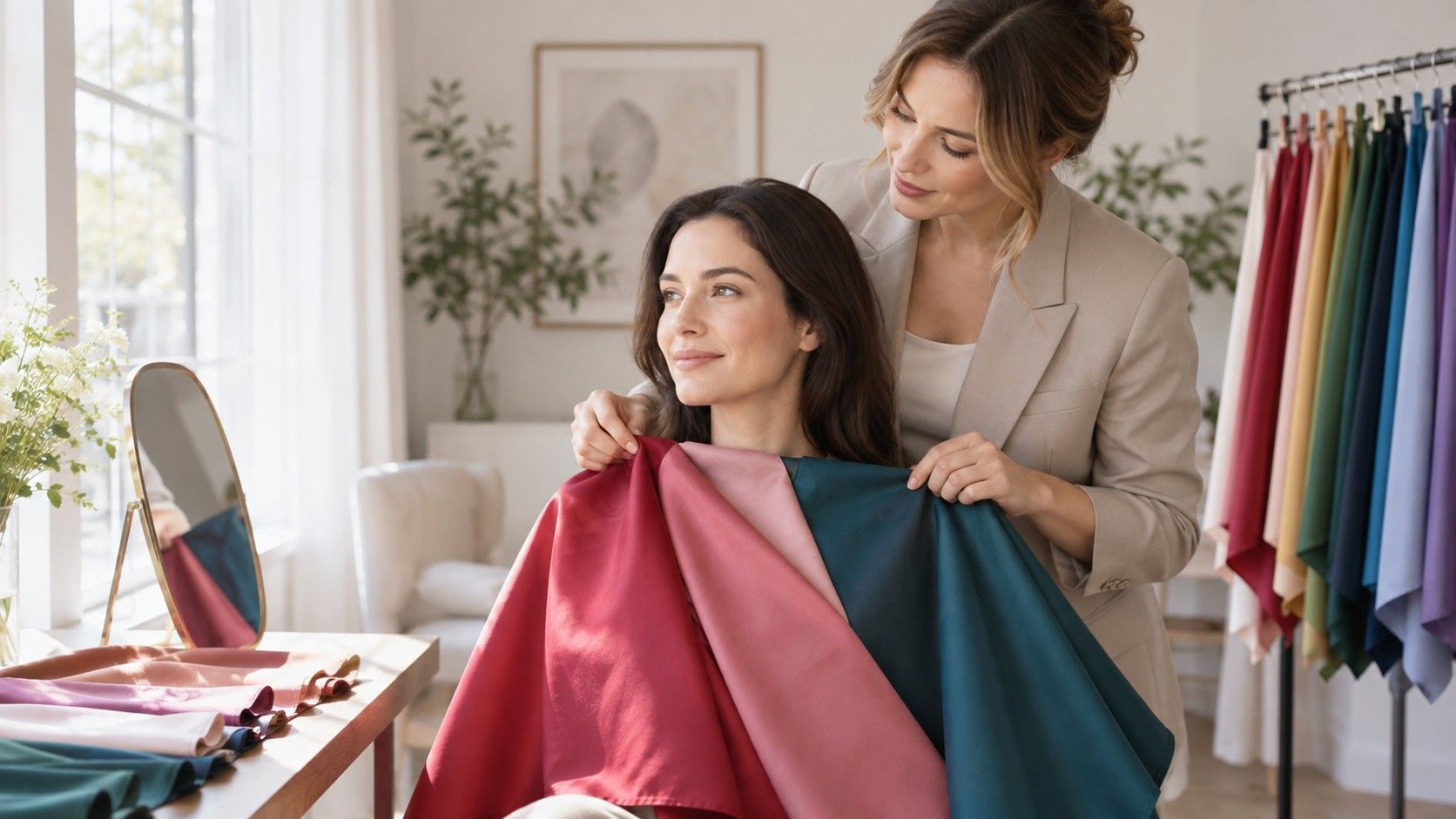
Color analysis is less about discovering a flattering label than about noticing what changes when color sits next to your face. A clear tomato red can make one person look rested and another look slightly grey; a muted rose can do the reverse. Personal color analysis gives those reactions a vocabulary, then turns it into a small set of choices that are easier to repeat in a shop, in a fitting room, or while editing a crowded wardrobe.
What color analysis actually measures
The useful part of colour analysis is comparative. It does not rank colours as good or bad, and it does not try to diagnose a personality from an eye colour. It compares how a fabric affects the visible balance of skin, eyes, hair, and features. When a color works, the eye tends to land on the face. When it does not, people often notice the lipstick, the shirt, dark circles, redness, or uneven skin first.
Most systems begin with three properties: temperature, value, and chroma. Temperature describes whether a color leans warm or cool. Value is its lightness or darkness. Chroma is its clarity or softness. A bright cobalt and a dusty blue can both be cool, yet one may overpower a low-contrast face while the other makes it look calm. That is why a single warm-versus-cool question rarely settles the result.
Seasonal color analysis packages these relationships into memorable groups such as Spring, Summer, Autumn, and Winter. The names are useful shorthand, not a scientific boundary. Within any season, people vary in depth, contrast, and tolerance for bright color. Treat a season as a starting drawer of paint rather than a rulebook that forbids every shade outside it.
The three clues worth noticing before a quiz
Start with undertone, but do not confuse it with surface color. Skin can tan, flush, freckle, or show temporary redness while its underlying balance remains relatively warm, cool, or neutral. The familiar vein test is weak evidence because vein colour is affected by skin thickness and lighting. Better evidence comes from comparing two fabrics of similar depth: salmon against raspberry, ivory against crisp white, or warm olive against blue-grey.
Next, notice value. Someone with pale skin, light brows, and soft grey-blue eyes may be visually light even if their hair has a little ash in it. Someone with dark hair and dark eyes often carries more depth. Put a very dark charcoal tee next to a light, low-contrast face and it can seem to arrive before the person does. Put a pale stone colour next to a deep, high-contrast face and the effect may be washed out rather than refined.
Finally, look at chroma. Clear colors have a crisp, almost freshly mixed quality: bright turquoise, apple green, clean fuchsia. Soft colors contain more grey or brown: sage, smoky plum, muted teal. Chroma is a frequent source of mistaken color analysis online results because camera filters sharpen saturation and make everyone appear able to carry brighter shades than they can in ordinary daylight.
| Clue | What to compare | A useful sign |
|---|---|---|
| Temperature | Warm coral beside cool raspberry | One makes the skin look more even without extra makeup |
| Value | Light taupe beside deep charcoal | Your features remain visible rather than disappearing |
| Chroma | Dusty teal beside clear turquoise | The color supports the face instead of wearing you |
How to do an at-home drape test that is worth repeating
A drape test is simply a controlled comparison. Stand near a north-facing window or outside in open shade, with no direct sun on the face. Remove tinted glasses, heavy contour, and a strongly coloured scarf. Use a plain wall or a white towel behind you if the room has intense paint. The goal is not a perfect laboratory; it is to stop yellow bathroom bulbs and patterned wallpaper from deciding your palette.
Choose pairs that differ in one main way. Compare cream with optic white, brick red with berry red, camel with cool taupe, or moss with pine. Hold each fabric under the chin rather than over the shoulders. Photograph both without changing exposure, then look away for a minute and return. Immediate certainty can be misleading: the brighter option often wins the first glance simply because it is louder.
Check the face rather than the outfit. Does the jawline seem more defined? Are under-eye shadows less noticeable? Do the eyes look clear without needing mascara? A good drape does not make skin flawless. It makes the usual variation in skin look coherent. A poor drape can pull yellow, blue, or red forward in a way that makes you want to correct your complexion, even though the problem is the fabric.
Repeat the comparison on two different days. Natural light changes with cloud cover, and tiredness changes how harsh a dark shade appears. If the same family wins twice, that is more useful than a dramatic verdict from one phone photo. Keep the winning swatches in an envelope or photograph them against a neutral grey card for future shopping.
Why hair color can make a result look different
Hair is a large block of color around the face, so a major dye change can alter the balance you see. Going from medium ash brown to copper introduces warmth and contrast. Going platinum can make black eyeliner and icy colors feel suddenly stronger. That does not necessarily mean your underlying coloring has changed; it means the visual frame has. A palette should work with the present version of you, not with an old passport photo.
If you colour your hair often, test with your current hair visible and with it loosely covered by a neutral towel. The first test tells you which clothes work now. The second can reveal whether a favorite color only works because it echoes the dye. This is particularly helpful when deciding between a warm hair appointment and a cool one: take a few candidate scarves to the salon rather than relying on a tiny digital swatch.
Eyebrow colour and makeup can create the same distortion on a smaller scale. A warm bronzer may make a cool berry lip look disconnected; a cool taupe brow product can make a warm palette look unexpectedly flat. For personal color analysis, bare-faced does not mean unpresentable. It means reducing variables long enough to see what the fabric is doing.
Using seasonal palettes without turning them into a uniform
Once you have a likely palette, begin with the colors closest to the face: tops, scarves, coats, glasses, earrings, and lipstick. These deliver the clearest return. Trousers and shoes are less influential, so a pair of black jeans or warm leather boots does not overturn the entire result. This practical order is kinder to a real wardrobe than replacing everything because a quiz assigned a new season.
Build a palette in roles. Pick two neutrals you will actually wear, two light colors, two deeper accents, and one colour that feels a little more expressive. For a soft, cool direction that might mean navy, dove grey, smoky rose, faded blue, plum, and muted teal. For a warm, clear direction it could mean warm navy, cream, leaf green, coral, tomato red, and honey. The exact names matter less than the shared temperature, value, and chroma.
Use store lighting as a stress test, not a final judge. A department-store mirror often has overhead lights that flatten shadows and make warm colours look safer. Step toward a window with two options and take one neutral photo. If both are plausible, choose the one that works with several items you already own. Color analysis should reduce orphan purchases, not generate a more elaborate set of rules.
What an online result can and cannot settle
A color analysis online tool can be a useful prompt to compare colors you would otherwise ignore. It can also be fooled by white balance, beauty filters, hair highlights, tinted lenses, and a single poorly exposed photograph. An app that returns a precise sixteen-season label from one selfie is making a stronger claim than the image can support. Use its result as a hypothesis, then test the key directions with fabric in daylight.
Be especially cautious when the recommendation rests on eye colour alone or says that every warm shade is wrong because you have blue eyes. Eye colour is only one small element in a face. Neutral undertones are common, contrast can change with hair, and many people can borrow successfully from a neighboring palette. The more useful question is not whether you have permission to wear a colour, but whether it makes your face look like it has had a decent night's sleep.
The best outcome is a short personal record: colours that consistently brighten you, colors that work only with makeup, shades that are fine away from the face, and a few difficult colours you no longer buy by accident. That record travels well between shops, seasons, hair changes, and trend cycles. It also leaves room for taste, which is the part no test can calculate for you.