Most of us discover a bad clothing color after paying for it: it looks promising in the changing room, then the first elevator mirror makes the face look tired. A color test for clothes is a much cheaper habit. It does not require a seasonal label or a dramatic closet purge. It asks a simpler question: when this color sits near your face in normal light, does it make you look awake, steady, and like yourself?
Test clothes where they actually affect your face
A color on trousers, shoes, or a handbag behaves differently from a color in a collar, scarf, hat, or top. Begin with the items that frame your face. Stand beside a shaded window in daylight, with overhead lights off if they cast a yellow tint. Pull your hair back if it is dyed or very bright, remove tinted glasses, and use a mirror large enough to show the head and shoulders. Bathroom spotlights are persuasive but unreliable; they reward almost every color with a temporary glow.
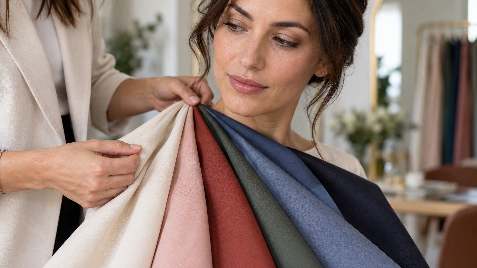
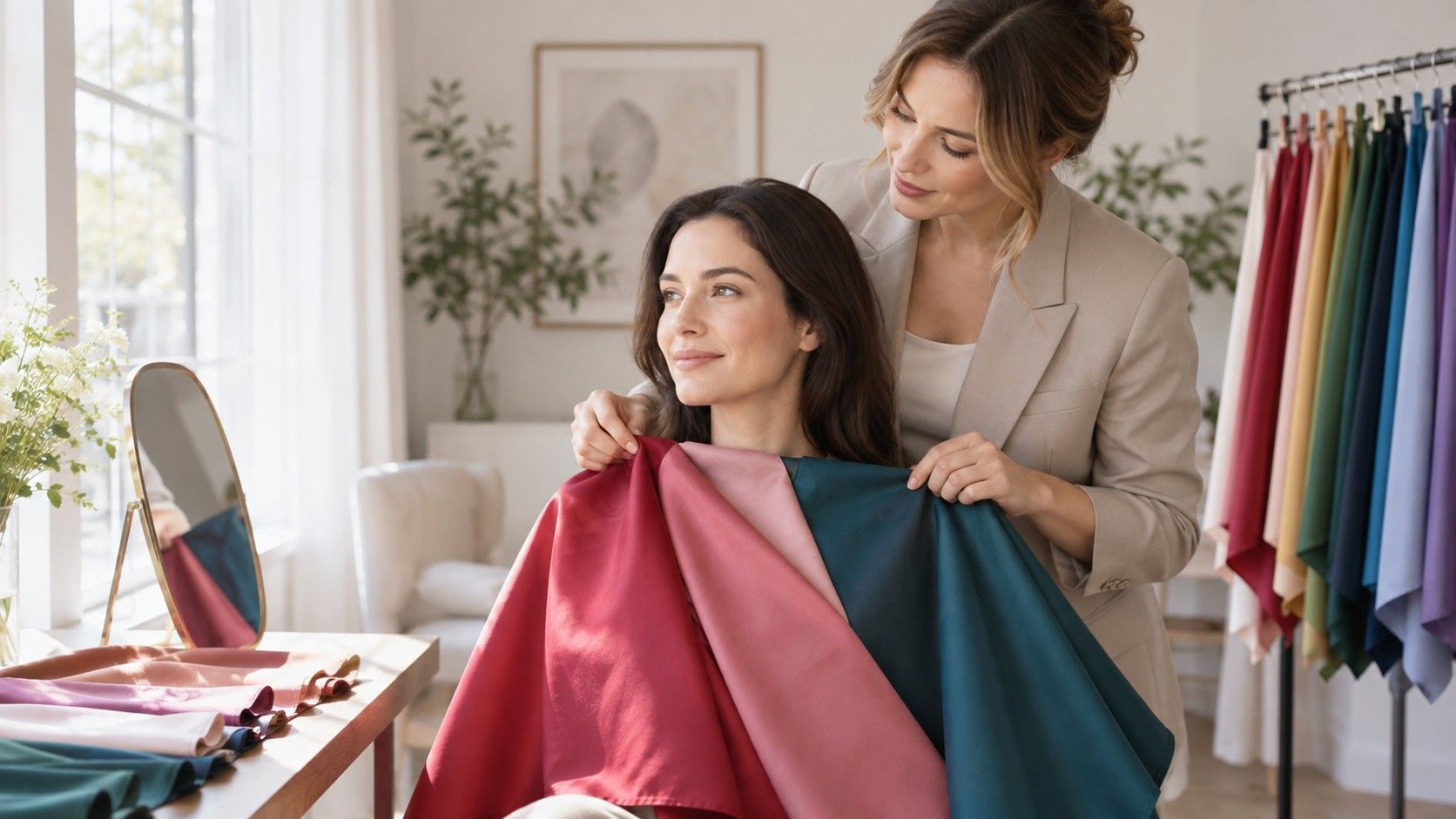
Hold a top or scarf directly under the chin. Step back two paces, then look at the skin beside the mouth, the under-eye area, and the whites of the eyes. The right color usually makes these areas look more even without asking for extra makeup. The wrong color can make redness, shadow, or sallowness more obvious. It is a quiet effect. If you are waiting for a color to transform you into a different person, you will miss the useful clues.
Do not judge from the color of your hands. A mustard sweater may look gorgeous held at arm’s length and still be difficult near the face. Likewise, a shade that is not your favorite on a rack can be unexpectedly kind in a neckline. This is why the test belongs at home, not in a store where bright mirrors, sales pressure, and a new purchase all make objective seeing harder.
Use a small group of comparable colors, not a chaotic pile
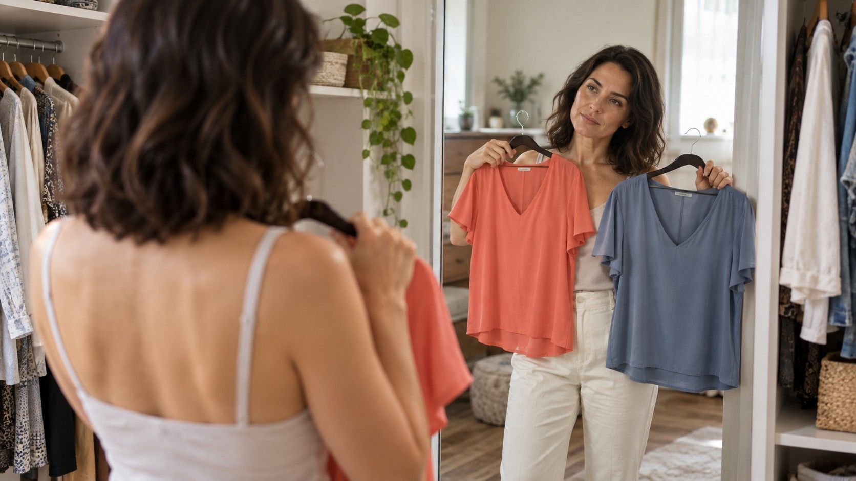
The fastest test compares neighbors rather than every color you own. Gather three blues, three reds, or three greens that differ in temperature, depth, or brightness. For blue, that might be icy blue, medium denim, and dark ink navy. For red, compare coral, tomato, and raspberry. Keep the fabric areas roughly similar; a huge black sweatshirt will overpower a narrow silk scarf no matter what undertone either one has.
Change one variable at a time. If you are testing cool versus warm red, choose versions with similar darkness. If you are testing pale versus deep blue, try to keep the warmth similar. Otherwise the result is muddy: perhaps the berry looked better not because it was cool but because it was deeper. This small amount of discipline prevents the familiar outcome where every color seems to give a different answer.
| Comparison | What it can reveal | Useful next step |
|---|---|---|
| Cream versus optic white | Likely temperature and brightness preference | Try warm navy versus blue-black |
| Coral versus raspberry | Warm and cool red direction | Repeat with lipstick or scarf |
| Charcoal versus black | Depth and contrast tolerance | Test a medium navy as a third option |
| Dusty sage versus clear emerald | Muted versus bright color preference | Compare similarly deep blues |
Lay the winners on a bed after each round. A pattern may appear before you can name it: perhaps you repeatedly choose softened, medium-dark colors, or perhaps crisp contrast wakes up your features. That pattern is more useful than a color chart for clothes copied from someone with different hair, skin, and styling. The chart you need is the one your own comparisons gradually create.
Know what to notice in skin, eyes, and the outline of the face
When people ask, what color clothes look best on me?, they often watch only their eyes. Eyes matter, but the rest of the face tells the fuller story. A good color can make the jawline look more distinct and the skin around the nose calmer. A poor color can pull out gray under the eyes, make teeth appear less bright, or flatten the natural difference between brows, hair, and skin. Watch from a conversational distance, not with your nose against the mirror.
Photographs help when used carefully. Take one photo per comparison in the same place, at the same distance, without portrait mode or a beauty filter. Leave the exposure alone. Later, place the images side by side and cover the clothing with your hand for a moment. Which face looks rested? Which one seems to need rescuing with concealer? The answer is often clearer after a cup of tea than it was during the test.
Be careful with emotional attachment. A black top may be a familiar uniform, and a bright yellow blouse may carry a happy memory. Neither feeling invalidates the test. It simply means you can separate the question of harmony from the question of taste. Keep beloved difficult colors for days when you want the clothing to make a statement, and use proven colors for photos, meetings, or a low-effort morning.
Choose neutrals before the impressive statement shades
Neutrals do the heavy lifting in a wardrobe. Test black against charcoal, ink navy, espresso, deep olive, mushroom, camel, and soft gray before you decide what your “best red” is. The best neutral is not necessarily beige; it is the color that works repeatedly with your face and connects easily to other clothes. Denim counts if you wear it as a base. A muted plum or blue-gray can also function as a neutral if it does not demand special styling.
Build a set of four: two lighter, two darker. Someone who looks clear and cool might settle on soft white, dove gray, slate, and navy. Someone who prefers warmth and depth may find ivory, camel, olive, and espresso more useful. Try each pair together under the face. If your light neutral and dark neutral create too much visual drama, choose a softer dark. If the pair makes your features disappear, add a deeper anchor.
This is where returns become easier. Before removing tags, try a new top with at least two existing neutrals. Look in daylight, then in the evening hallway, then in a quick photo. If it only works with one exact pair of trousers and a particular lipstick, it may be a special piece rather than a useful wardrobe color. There is nothing wrong with special pieces; the point is to recognize them before they become expensive clutter.
Keep a photo record of clear winners and near misses
A color guide for clothes becomes reliable when you can remember the evidence. Make a simple album called “wearable colors,” not a grand inspiration board. Add one daylight image for each successful comparison and a short note: “soft white better than cream,” “medium teal beats bright aqua,” “black works with defined makeup only.” Notes like these are more practical than a vague declaration that you are “probably winter” or “maybe autumn.”
Review the album before shopping online. Screens distort color, but the record gives you a direction: look for muted blue-green rather than any teal, or for a deep berry rather than every red. When a package arrives, repeat the face-level test before washing it. This is especially useful with sale purchases, where a low price can make a questionable color seem suddenly rational.
Retest after a major change. New hair color, glasses, tanning, or a switch from high-contrast makeup to bare skin can alter the colors that feel easiest. Your underlying coloring has not become unrecognizable, but the visual balance around it has changed. A ten-minute test is small enough to repeat whenever your wardrobe starts giving mixed signals.
Turn the winners into outfits without making life beige
Once you know the few colors that help your face, use them near the neckline and allow more freedom farther away. A difficult skirt can still work under a better top; a beloved orange bag can stay even if orange near the face is unkind. This is the advantage of treating color analysis as placement rather than prohibition. It lets the wardrobe get more coherent without becoming timid.
For the next purchase, use one rule: it should work with two of your tested neutrals and belong to a color family that has already passed the mirror test. That rule is not glamorous, but it has a pleasant effect on a closet. Getting dressed becomes less like solving a puzzle, and more like noticing that the clothes you own have finally started cooperating.