When someone asks, what is my color palette?, they usually want a quick label and a neat row of swatches. The more useful answer is less theatrical: a palette is a repeatable way to choose colors that do not compete with your face. You can begin at home, for free, with a window, a mirror, a few clothes you already own, and enough patience not to let one flattering lipstick decide the whole case.
A palette is a working kit, not a personality test
A personal color palette is a group of colors sharing a similar temperature, depth, and clarity. That does not mean every item must be the same muted blue or warm brown. It means the colors tend to make your skin look steady rather than patchy, your eyes noticeable rather than lost, and your features present before the clothing enters the room. The useful question is not whether a shade is beautiful on a hanger. It is whether it lets people see you first.
I like to start with the laundry-pile test. Pull out three tops you repeatedly wear, three that have stayed folded for months, and look at them against bare skin in indirect daylight. The result is often more honest than a color chart. A favorite black tee may feel practical but make the shadows under your eyes look bluish. A forgotten soft navy may suddenly explain why people say you look rested in it. Those observations are evidence, even when they do not fit the palette name you expected.
Seasonal palette systems can be useful shorthand, but they are not a dress code. They sort color tendencies into combinations such as warm and muted or cool and bright. Keep the system in the background until you have looked at actual fabric. A label like Soft Autumn is only valuable if it helps you choose between dusty teal and icy teal at a shop; it is not valuable if it makes you reject a color that consistently works.
Find your temperature in daylight, with two nearly identical colors
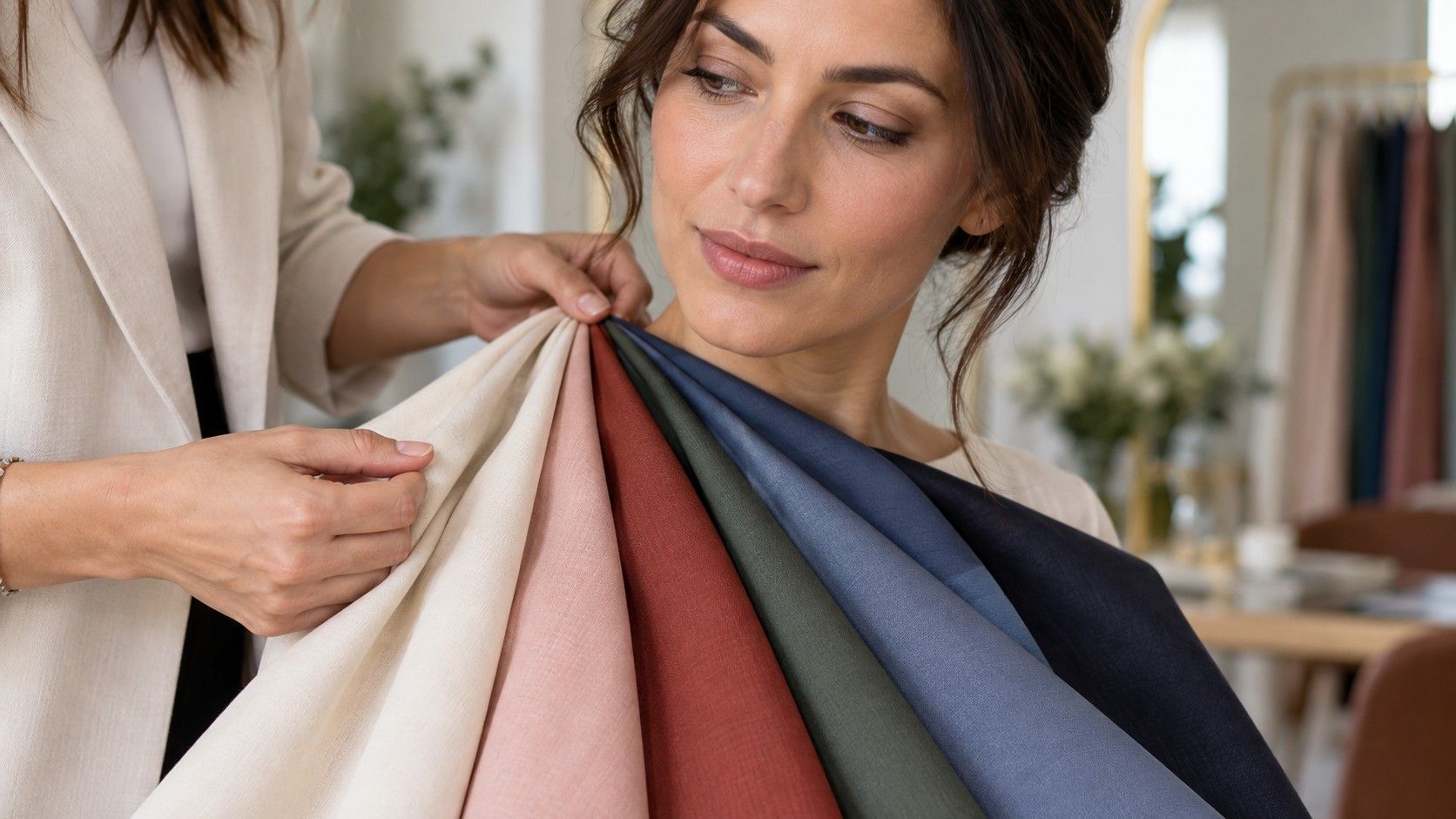
Undertone is the temperature beneath the changing surface of the skin. A tan, a breakout, winter dryness, and a camera filter can alter surface tone; undertone usually changes far less. Sit facing a north-facing window or any bright shaded window. Turn off the bathroom’s yellow overhead light, remove tinted makeup if possible, and hold two fabrics under your chin: one clearly warm, such as tomato red or cream, and one clearly cool, such as raspberry or optic white.
Watch the skin around the mouth, nose, and under-eyes rather than the color of your cheeks. The better fabric usually makes redness look quieter and the jawline more even. The wrong one can create a faint gray cast, make the face appear sallow, or draw your attention to texture. It is a modest difference, not a magic trick. If both are convincing, you may be neutral, olive, or simply comparing colors that are too close to call.
The metal test is a supporting clue. Hold a matte gold chain and a silver-colored chain beside the same area of skin, preferably without polished surfaces flashing in the sun. Warm gold can harmonize with warm undertones, while silver often looks cleaner against cool ones. Yet jewelry has its own variables: scale, finish, and the stone color can flatter independently. A brushed silver watch may work beautifully on a warm person because its charcoal strap and simple shape are doing half the work.
Measure depth and contrast before collecting swatches
Once temperature is roughly clear, look at value. Depth asks how light or dark the colors near your face can be before they wear you. Compare a pale dove gray, medium denim, and near-black charcoal in the same light. Someone with deep hair, dark eyes, or strong facial features may carry charcoal easily; someone with a very light overall coloring may look more balanced in pewter, mushroom, or softened navy. This is not about skin color alone. It is about the combined light-dark pattern of hair, eyes, brows, and skin.
Contrast is the distance between those elements. High-contrast faces can often handle crisp combinations such as ivory and ink, a defined print, or a dark collar against a light shirt. Low-contrast faces often look more integrated in blended combinations: sage with soft olive, smoky rose with cocoa, denim with blue-gray. Stand two meters from the mirror and squint. If a sharp outfit arrives before your face does, reduce the contrast; if a gentle outfit makes your features disappear, add one darker or clearer note.
| What you notice | Try first | Be cautious with |
|---|---|---|
| Your features read light and blended | Soft medium values, tonal outfits, softened neutrals | Hard black-and-white blocks |
| Your brows, eyes, and hair create a clear pattern | Defined edges, deeper anchors, clearer accents | Head-to-toe dusty pastels |
| Bright colors seem loud before they look good | Smoky or gently muted versions | Very neon or highly glossy shades |
| Muted colors make you look flat | Cleaner blue, red, green, or berry accents | Too much gray mixed into every color |
Brightness is separate from depth. A dark, clear emerald and a dark, smoky forest green may be equally deep but produce entirely different effects. Use a scarf, T-shirt, or printed paper if fabric is limited. The winning color makes the whites of the eyes look clearer without needing more makeup. Take a few unfiltered photos from the same distance; phone screens are imperfect, but side-by-side images prevent the mirror from changing the story every time you move.
Choose four dependable neutrals for ordinary mornings
A useful my color palette begins with neutrals because most wardrobes live there. Rather than declaring that everyone needs black, test black against softened alternatives: charcoal, ink navy, espresso, deep olive, taupe, camel, stone, and mushroom. Put each near your face, then ask which one makes it easiest to imagine a full day in it: work light, grocery-store light, a restaurant mirror, and a photograph after sunset. A neutral that works only in a bedroom mirror is not dependable enough.
Choose two light and two dark neutrals that can meet each other without looking accidental. For a cool, low-contrast direction, that might be soft white, dove gray, slate, and navy. For a warm, deeper direction, ivory, camel, espresso, and olive might do more work. Neutral does not mean beige; it means a color that can carry repeat wear. Denim often counts, and so does a quiet blue-gray or muted plum if it behaves like a base in your closet.
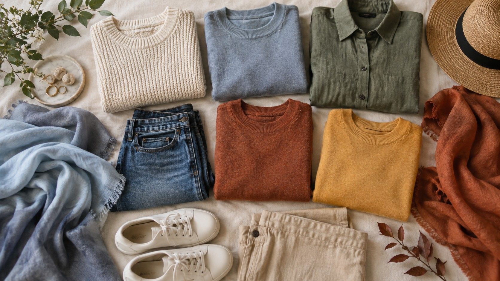
Then make a small wardrobe edit. Lay your chosen four neutrals on the bed and place ten existing items beside them. Keep a note of the pieces that coordinate without effort and the pieces that only work with one exact outfit. The first group tells you more about your real palette than a shopping mood board. The second group is not a failure; it may simply be an accent, a special-occasion item, or a color better kept away from the face.
Test accent colors before buying the dramatic version
Accent colors are where a palette becomes personal. If you think you suit cool colors, compare berry with orange-red; if you think you suit warm colors, compare coral with fuchsia. Keep the fabric size similar and place each at the same distance from the chin. The better choice often makes the lips look naturally defined. The weaker choice can make the lips vanish or make the skin seem as though it needs correcting. It is a small, reliable cue when you look for it calmly.
Do not buy a blazer because a two-inch paint chip looked promising. Start with a scarf, knit, nail color, or inexpensive top and wear it in three settings. Indoor warm light is especially revealing: some colors that glow beside a window turn strangely yellow or gray at dinner. Ask a friend only one precise question, such as whether your face looks rested or whether the shirt is the first thing they notice. Broad questions invite polite answers.
If you want to find my color palette free, make a simple record rather than chasing endless online quizzes. Photograph each comparison in daylight, write down the color pair and result, and revisit it a week later. Patterns emerge: perhaps soft ivory always beats pure white, medium dark blue beats black, and clear cranberry beats dusty rose. That is already a palette with purchasing power. A seasonal name can come later, if it adds clarity rather than pressure.
Use the result as a filter, then leave room for taste
Your first palette should make decisions easier, not make a closet smaller. Set a practical rule for the next few purchases: choose a color that works with at least two of your proven neutrals and has passed a face-level test. If a spectacular exception appears, keep it. Style is allowed to have a little friction. A difficult yellow dress can still be worth owning if you love it and know that a better lipstick or jacket will balance it.
Review the evidence at the end of a season. Hair color, glasses, tanning, and a change in how you wear makeup can move the best range slightly, particularly around depth and contrast. Undertone is not a prison, and no honest undertone analysis produces only one correct red. The goal is to recognize why one red makes you look alive while another takes over the room. Once you can see that difference, your palette is doing its job.