A free color analysis test can be a pleasant way to narrow a rack of colours, but it is easy to give it the wrong evidence. A selfie taken under a kitchen pendant, with a warm filter and a bright red top, may produce a confident-looking result that has more to do with the room than with your coloring. A better approach is to treat the test as the first comparison, then check its suggestion with fabric, daylight, and your own eyes.
What a free test can and cannot tell you
Most free colour analysis tools look for patterns in a photograph: the relationship between skin, hair, eyes, and the colors that surround them. They may offer a warm or cool direction, a level of contrast, or a seasonal family. That can be genuinely useful if it encourages you to compare warm ivory with white, muted blue with bright blue, or deep plum with black. The value lies in the experiment that follows, not in treating the label as a verdict.
A phone image cannot reliably see an undertone in the way a person can compare live drapes. Camera software adjusts white balance, smooths skin, and often boosts warmth in indoor light. Different screens then change the image again. If two phones give different results, that does not mean your coloring changed overnight. It means the tool has reached the limit of its input.
Use a color analysis quiz as a hypothesis generator. If it suggests soft, cool colors, test a smoky blue and a dusty rose against a clear turquoise and a vivid orange-red. If it suggests warm, light colors, compare cream, peach, and leaf green with stark white, icy pink, and blue-grey. You are looking for a repeatable direction, not a perfect personality profile with an official season stamp.
Set up a photo that gives the test a fair chance
Choose open daylight, ideally beside a window facing the sky rather than in a stripe of direct sun. North-facing light is often easiest because it stays relatively even, but a bright overcast day works well too. Turn off nearby lamps. Their yellow or pink bulbs can make a neutral face look golden and cause a free color analysis tool to push every answer warmer than it should.
Face the light with a plain, neutral background behind you. A white wall is fine if it is truly white; soft grey is even better. Avoid a turquoise bedroom wall, a bright patterned curtain, or a car interior with tan upholstery. Colored surroundings reflect into the face and become part of the data. Pull hair away from the cheeks if it is very bright, and remove tinted glasses, a vivid scarf, or a high-necked top that dominates the frame.
Makeup deserves a sensible middle ground. Heavy foundation, contour, self-tan, and a saturated lipstick can hide the exact shifts you are trying to observe. A little concealer or clear brow gel is not a crisis. The aim is simply to let the camera see your usual skin tone rather than a carefully constructed evening face. Take the photo at arm's length or use the rear camera with a timer, keeping the lens level with the eyes.
| Photo choice | Why it matters | Better option |
|---|---|---|
| Warm indoor bulb | It adds yellow and changes apparent undertone | Open window light with lamps off |
| Beauty or portrait filter | It alters texture, contrast, and color balance | Plain camera mode with no enhancement |
| Bright top or background | It casts colour onto the skin and distracts the test | Grey, white, or a low-saturation neutral |
| One dramatic selfie | It can capture a temporary shadow or flush | Two or three photos on different days |
Answer the quiz questions as observations, not identities
Many color analysis test free forms ask whether you look better in gold or silver, whether your veins look green or blue, and whether you tan or burn. These questions are convenient, but none is decisive. Jewellery can be plated, oxidized, and placed against different clothes. Veins are influenced by lighting and skin thickness. Tanning behavior is mostly about sun response, not a neat shortcut to a seasonal palette.
When a question feels split, choose neutral or uncertain if that option exists. A forced answer can send a quiz toward an exaggerated conclusion. It is more accurate to write down what you see: antique gold is good but shiny yellow gold is harsh; silver works with berry lipstick but not when you are tired; both white and cream can work, although one needs more makeup. Those distinctions are where useful personal color analysis begins.
Pay attention to contrast in ordinary life. Do strangers first notice your strong dark hair against pale skin, or do your features blend softly until you add mascara? Does a black top sharpen your face or produce under-eye shadows? A person can be cool and low contrast, warm and high contrast, or neutral with a preference for muted color. The usual quiz categories simplify this, so your own comparison should be allowed to be more nuanced.
Cross-check the result with fabric before buying anything
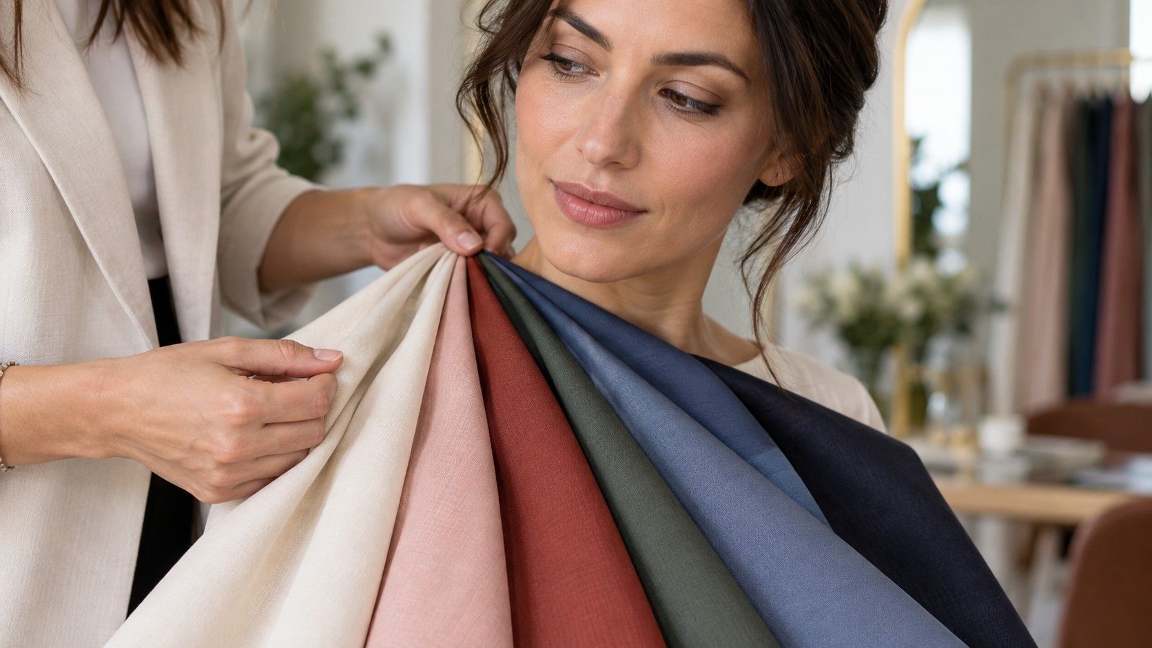
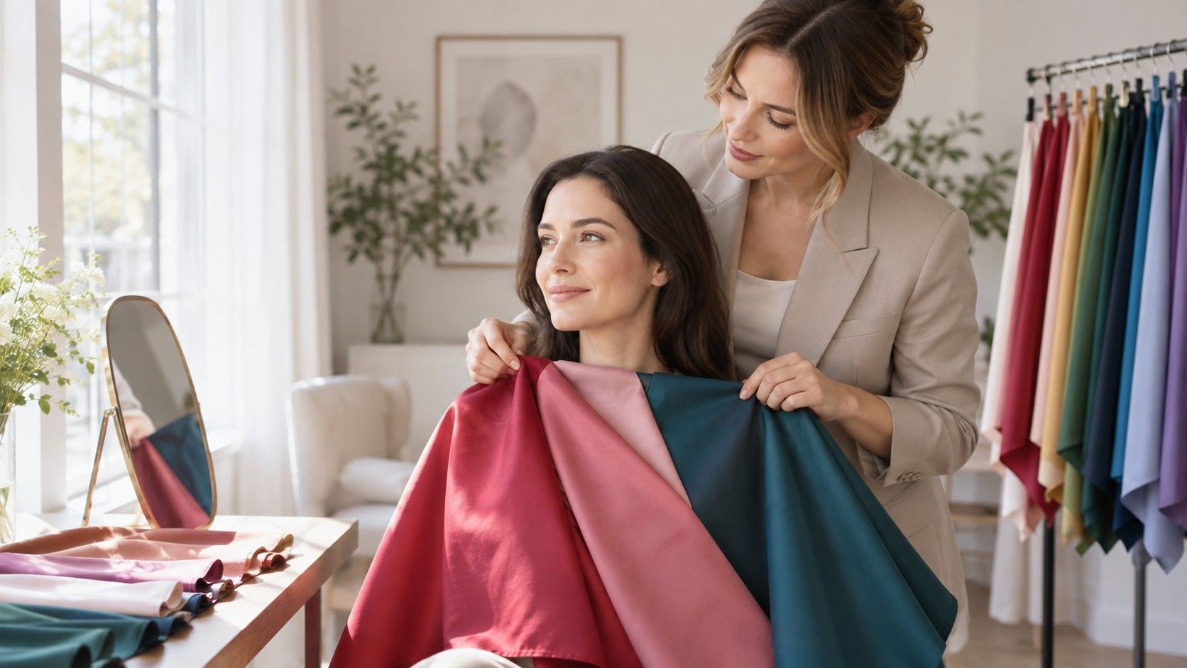
Fabric is more revealing than a digital color wheel because it reflects light onto the face. Gather items you already own: a white tee and a cream knit, black and navy, rust and berry, olive and blue-grey, a muted pink and a clear pink. The fabrics do not have to be perfect textbook samples. They only need to make a visible contrast. Stand by the same window used for your photograph and hold each item under the chin.
Look at the skin around the mouth, the lower eyelids, and the edge of the jaw. A good color often makes small variations appear less separate. A poor one may accentuate sallowness, redness, or blue shadows. Do not judge by whether you like the garment in isolation. A favorite cobalt sweater may be gorgeous on a hanger and still make your face look less rested than a quieter ink blue.
Photograph each pair with the same exposure. Then review them later, ideally on a screen with night mode switched off. The first look often favors the brighter or darker choice because it has more visual drama. On a second look, the more harmonious option is usually the one where you notice the person's expression before the cloth. Repeat checks matter because one tired morning or a patch of reflected window light can create a false winner.
How to read common results without trapping yourself in a season
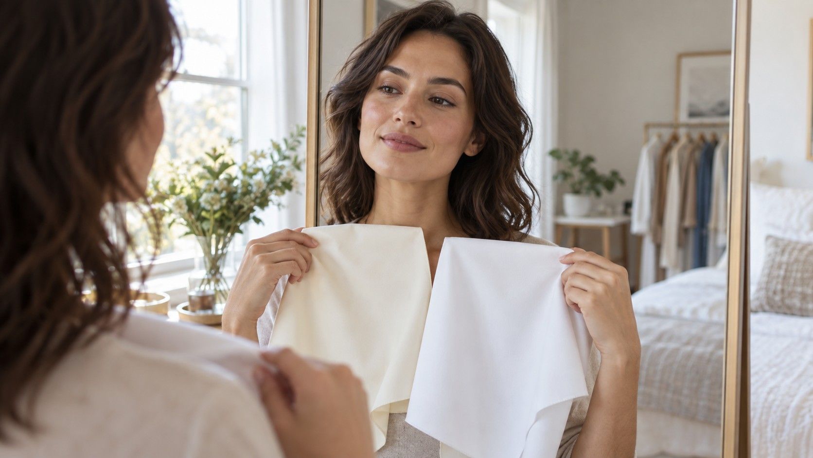
If a free color analysis result calls you warm, begin by testing warmth gently. Compare camel with cool stone, coral with blue-red pink, and cream with optic white. You may find that you are clearly warm, broadly neutral, or warm only when colors are soft. The last option is common and explains why some people like warm earthy shades but dislike loud marigold or bright orange.
If the result calls you cool, test blue-based berry, charcoal, soft navy, and blue-grey beside their warmer neighbors. Cool does not automatically mean icy or high-contrast. A muted cool palette can make black look severe while dusty plum and softened navy look far better. Likewise, a cool person with deep coloring may carry dark jewel tones more easily than pale pastels. Temperature is only one of the three color controls.
Seasonal names are memorable, but neighboring palettes overlap. A soft summer-like person may borrow a few muted autumn greens; a deep winter-like person may look excellent in selected deep autumn browns. Use the palette as a map of likely success, then make notes on exceptions. Clothing is worn in changing light, with different hair colors and makeup, not in the frozen conditions of a quiz result.
When a second opinion is worth more than another app
Ask for a second set of eyes when the comparisons are genuinely close, when you have recently changed hair color, or when you have a skin condition that makes surface redness unusually variable. A friend does not need to be a stylist. Give them one simple job: look at your face while you alternate two fabrics, and say which one makes the skin look clearer. Their reaction is most useful when they do not know which answer you expected.
A trained in-person consultation can add more drapes, consistent lighting, and experience with subtle neutral undertones, but it is not mandatory for a usable wardrobe. Before paying for one, make a folder of your daylight photos and note the colors that repeatedly work. You will get more from a consultation if you can explain whether black feels striking or draining, whether cream is better than white, and which lip colors make your face look awake.
There is no need to rerun a color analysis quiz every time a trend changes. Revisit your evidence after a major haircut, a shift in hair dye, or a change in the kind of makeup you wear. Otherwise, keep the result practical: choose the neckline colors that help on an ordinary workday, let difficult shades live below the waist or in small accessories, and leave a little room for colors you simply enjoy. A test is useful when it makes those choices easier, not when it makes getting dressed feel like an exam.