Olive skin is often described as green, which is accurate enough to be confusing. Few people look green in a mirror. More often, the skin seems beige in one room, a little gray next to peach makeup, and unexpectedly golden or cool in photos. The useful question is not whether you can spot an olive cast on command; it is whether repeated color comparisons explain why certain foundations and clothes keep looking slightly off.
What an olive undertone can look like in ordinary light
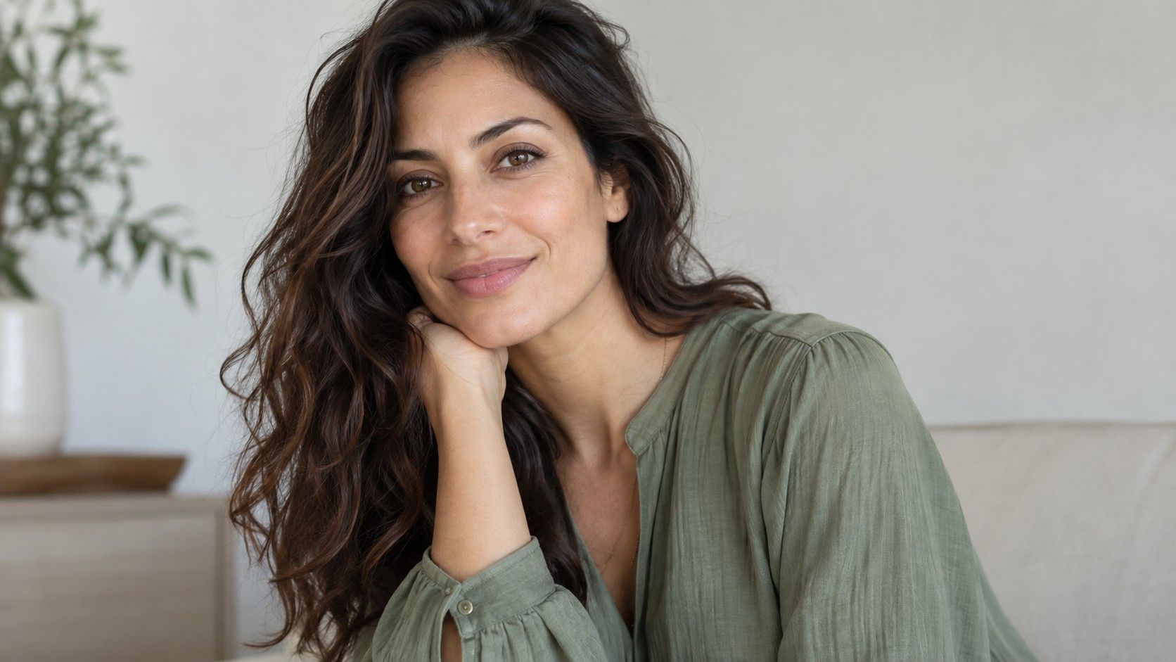
An olive skin tone has a muted yellow-green or gray-green quality beneath the surface. It may sit under fair, medium, tan, or deep skin, and it can coexist with visible pinkness on the cheeks. That combination is why a wrist-vein test is rarely decisive. Veins are blue-green on many people, while the wrist is thin-skinned and affected by temperature. Look instead at the whole face in indirect daylight, especially the jaw and the area beside the mouth.
Olive coloring often becomes obvious by contrast. Very peachy concealer can look orange against it; a strongly rosy foundation may look separate from the neck. Some people notice a faint gray cast in images where a warm filter has been removed. Others simply find that mustard, saffron, and clear orange make the face look tired, while softened teal or dusty berry brings it back into focus. These are clues, not a membership test.
Olive skin can be fair, deep, warm, or cool
Depth and undertone are different measurements. Fair olive skin can appear almost pale in winter yet still reject the pink foundations usually assigned to fair complexions. A deep olive complexion can carry rich warmth and still look better in blue-based jewel tones than in yellowed khaki. Treating olive as a medium-tan category leaves out a great many faces and leads to unnecessary confusion at makeup counters.
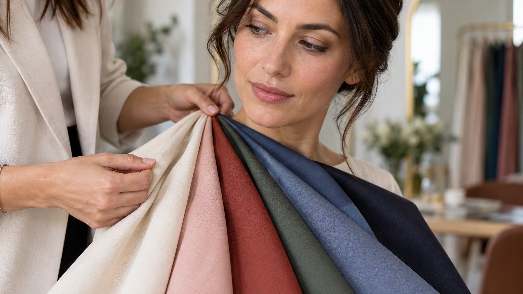
Cool olive skin tone usually has more gray, blue, or muted green beneath the surface. Warm olive may show more golden yellow or bronze, particularly in sunlight. Neutral olive can move between the two depending on the surrounding color. Instead of trying to identify the exact label from one selfie, test pairs: warm ivory against soft white, paprika against muted rose, yellow-green against blue-green. The better fabric makes the skin look even before the eye notices the garment.
Why foundation labels can make olive coloring seem impossible
Foundation ranges often divide undertones into warm, cool, and neutral, with olive added late or translated into “golden.” Golden is not always olive. A yellow base can make an olive complexion look bright in the center of the face but oddly orange along the jaw. A pink or red base may cancel surface redness at first glance yet produce a gray or mask-like edge in daylight. This is not vanity; foundation sits beside the neck, where the mismatch is hard to ignore.
Test at least three narrow stripes along the jawline and leave them for ten minutes. Pigments oxidize, skin warms up, and store lighting stops being persuasive once you walk toward a window. The closest match seems to disappear across both face and neck, not merely cover a red patch on the cheek. If every nearby shade is wrong in a different way, mixing a small amount of blue-green adjuster with a workable depth can be more realistic than buying a dramatically darker or lighter formula.
| What the product or color does | What it may suggest | Try beside it |
|---|---|---|
| Foundation turns orange at the jaw | Too much warm yellow or peach | A muted neutral or olive-leaning base |
| Pink base looks flat or ashy | Too much rose for the underlying cast | A neutral with a little yellow-green |
| Bright orange clothing dominates | Clear warmth may be too strong | Terracotta, muted coral, or dusty rust |
| Cool gray feels lifeless | Depth or warmth may be missing | Soft navy, cocoa, or muted teal |
Colors that often bring olive skin into focus
Muted colors are a good place to begin because they do not force the skin to compete with intense yellow, pink, or blue. Blue-green, eucalyptus, plum, soft navy, muted raspberry, cocoa, and charcoal often create a calmer effect. That does not mean every olive complexion belongs in a dusty palette. A high-contrast person with dark hair and bright eyes may look excellent in deep emerald or saturated sapphire; a low-contrast person may prefer softer versions of the same families.
Be careful with universal color advice. “Olive people look good in olive” can be true, but a yellow olive shirt may make a warm olive face disappear while a smoky sage works beautifully. Beige is another tricky category: pink-beige can look drained, yellow-beige can turn sallow, and mushroom or taupe can be surprisingly easy. Test the color by the face, not by whether its name seems logically compatible with your undertone.
Test your best metals, neutrals, and makeup without a costume change
Put a silver earring or foil on one side of the face and soft gold on the other, then step back from the mirror. If neither is clearly better, you may be neutral enough to wear both; texture and finish might matter more than metal color. Brushed gold, oxidized silver, and champagne metal are often easier on olive skin than a very bright, mirror-like finish. Repeat the comparison in daylight, because warm bathroom bulbs make gold win almost every contest.
For makeup, compare a muted rose lip with a coral lip, then a blue-red with a brick red. Do not judge only the lip color. Look at the skin around the mouth and the teeth. The more successful option makes the entire face look coherent. Save a photo of the winning comparisons in the same window light, because memory tends to promote the shade that felt exciting rather than the one that actually balanced the complexion.
Build a palette that accounts for season and real life
An olive undertone does not freeze your wardrobe in one season. Summer sun may deepen surface tone and make stronger colors feel natural; winter may call for lighter, softened versions. Hair color can also change the contrast around the face. Re-test a few proven neutrals after a major dye job instead of assuming every old recommendation has expired. The underlying cast remains, but the visual balance can move.
Start with three dependable near-face colors and wear them in different conditions before adding more. Perhaps soft navy, muted berry, and deep teal keep looking good; perhaps your reliable neutrals are charcoal, cocoa, and off-white. That small collection is more useful than a long list of colors someone says olives “should” wear. The point is not to prove you have olive skin. It is to recognize choices that make your face look clear rather than quietly dull.