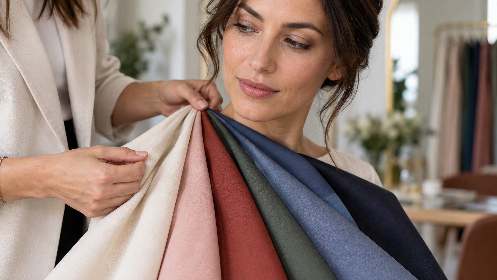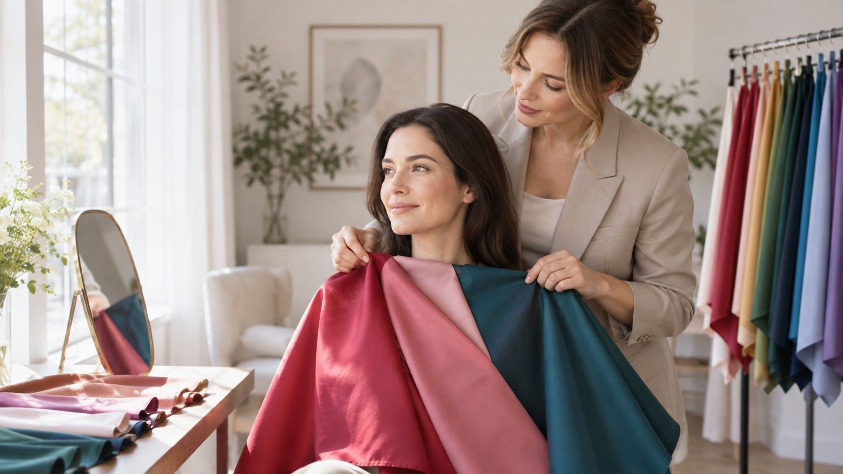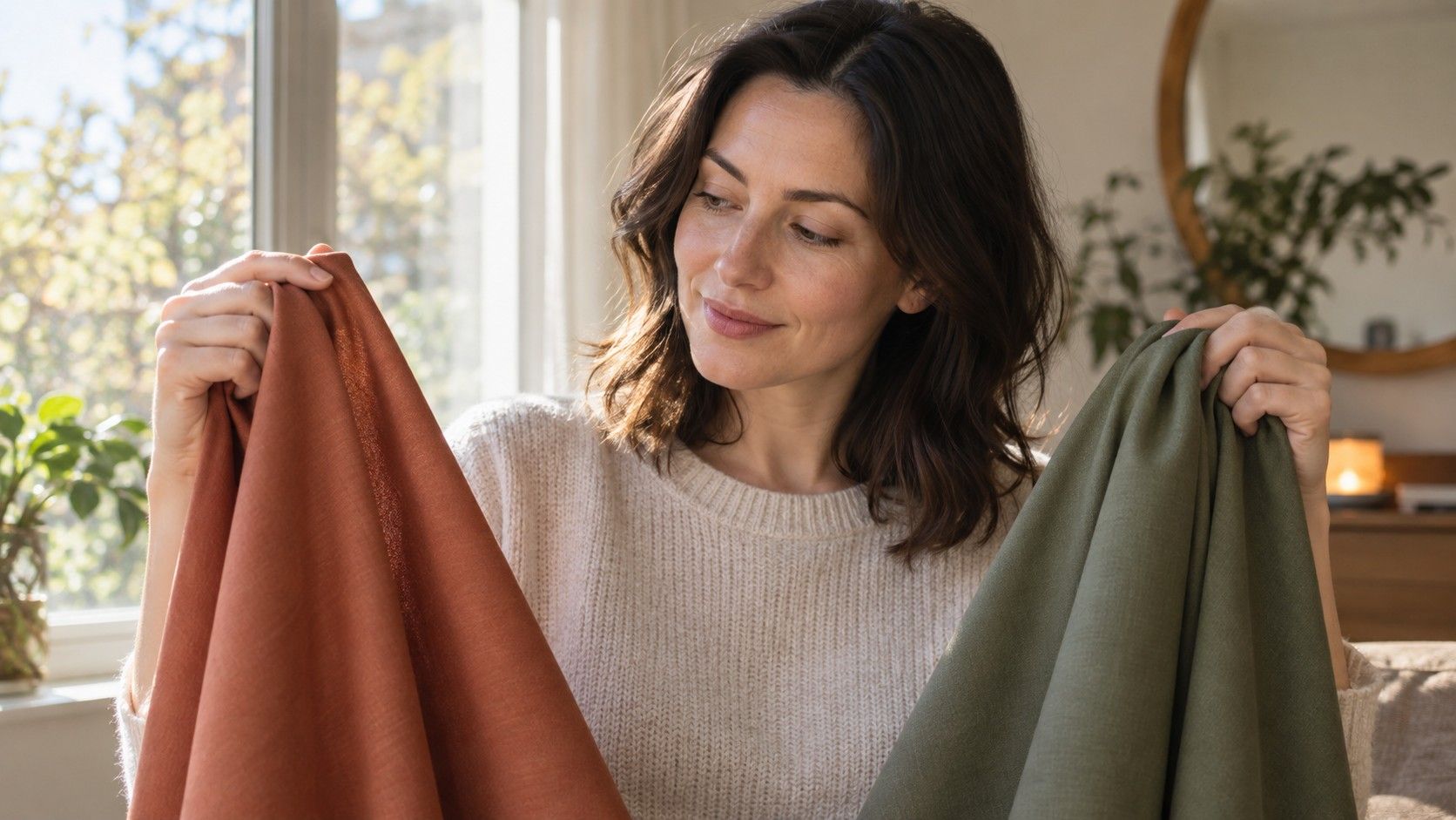
A personal color test is most useful when it helps with Tuesday-morning decisions, not when it produces a dramatic label for a social profile. You are looking for colors that let your face look rested in daylight, on a phone camera, and in an ordinary cafe mirror. That requires a small experiment rather than a single selfie. With a few fabrics, a window, and notes you can actually read later, the process becomes surprisingly clear.
Prepare before you compare colors
Choose a time with steady daylight. Bright shade beside a window is ideal; direct sun creates sharp shadows, and yellow ceiling lights make warm colors win by default. Face the window rather than standing with it behind you. If possible, remove foundation, self-tanner, and strongly colored lipstick. This is not a demand to look “natural.” It is simply a way to keep the test from measuring your makeup instead of your skin.
Wear a plain top in a soft neutral that does not pull attention: gray, muted navy, or a quiet white that you already know is tolerable. Tie back hair if it is vividly colored, and take off tinted glasses. These details matter because hair, frames, and a bright shirt act like their own fabric swatches. A red curtain behind the mirror can influence the result too; move to a plain wall if the room is doing half the styling.
Take a baseline photo before adding any fabric. Use the rear camera if a friend can help, or prop the phone at face height. Turn off portrait mode, filters, and automatic beauty settings. Photograph the face and upper chest from the same distance you will use later. This baseline is not a beauty test. It gives you something to compare when your eyes become tired after the fourth blue scarf.
Pick a baseline color and make fair fabric pairs
Begin with a color you wear often, perhaps black, navy, cream, or denim blue. Hold it under the chin and note the immediate effect: do the eyes look clear, does the skin appear even, do the lips still have definition? Then choose one near neighbor that changes only one important feature. Compare black with charcoal, cream with optic white, coral with raspberry, or sage with emerald. A personal colour test becomes confusing when every sample changes temperature, depth, and brightness at once.
Scarves, T-shirts, pillowcases, towels, and even matte paper can work. Fabric is better because it reflects light more like clothes do, but do not postpone the test while waiting for professional drapes. Place the samples at the same height and keep the room and camera position unchanged. Switch one out, look away for a few seconds, then look again. The pause prevents the more saturated color from winning merely because it is louder.
| First pair | What to observe | Helpful follow-up |
|---|---|---|
| Ivory and optic white | Yellowing, redness, eye clarity | Soft navy and blue-black |
| Coral and raspberry | Lip definition and facial warmth | Tomato red and blue-red |
| Charcoal and black | Whether shadows deepen or features sharpen | Medium denim as a middle value |
| Dusty teal and clear teal | Whether muted or bright color leads | Repeat with green or pink |
Use one baseline for the first round, then repeat with a different family. A cool-looking white result and a warm-looking red result can coexist; the red samples may have been different in brightness as well as temperature. You are not trying to force every comparison into one verdict. You are collecting small pieces of evidence and looking for the result that repeats across several color families.
Run temperature and brightness checks separately
Temperature asks whether colors with a warmer yellow-red direction or a cooler blue-red direction tend to support your face. Compare cream with optic white, peach with cool pink, tomato with raspberry, or olive with blue-green. Watch the jaw, under-eyes, and the sides of the nose. A harmonious color tends to make the skin seem more continuous. A less harmonious one can add a gray, yellow, or overly flushed impression. The difference is usually gentle, which is why two or three pairs are better than one.
Brightness asks whether clear, vivid colors or softened, smoky versions suit you better. Compare a crisp emerald with forest green, bright aqua with blue-gray, or clear fuchsia with dusty rose. Depth is another separate question: can you wear near-black easily, or do medium values such as slate, mushroom, and medium denim look more balanced? People often mistake a depth problem for an undertone problem. A deep cool color may be too heavy for someone who is cool but light overall.
Seasonal names can be a useful map after you see a direction, but not before. If repeated tests suggest cool, muted, medium values, you may eventually recognize a Soft Summer-like range. If warm, deep, clear colors keep winning, another seasonal description may help. Treat the name as a filing label, not a law. The fabric is the witness; the label is only a way to remember what the witness said.
Record changes in the face instead of chasing a perfect category
Keep a small observation note for every pair. Write concrete things: “cream made my neck yellow,” “charcoal softened eye shadows,” “clear green looked louder than my face,” or “berry made lips look defined without makeup.” Avoid summaries such as “pretty” or “bad.” They are honest feelings, but they do not tell you why the color worked and they are hard to use when buying a coat six weeks later.
Review photos side by side after a break. Cover the fabric with a hand and look at the face first. Which version looks as if you slept well? Which one makes the eyes visible without hard contrast? A friend can help, but ask a narrow question: “Which face looks more even?” Broad questions like “Which do you like?” often measure the friend’s favorite color rather than your most useful one.
Mixed results are common, particularly with olive or neutral undertones. Veins might look green, silver jewelry may feel better, and soft berry may beat coral. That is not an error. Give face-level comparisons in daylight more weight than wrist-vein tests or online filters. A personal color test online can offer ideas, but it cannot control the lighting, screen calibration, makeup, or editing that change a selfie. Use it as a starting prompt, not the final judge.
Turn evidence into a usable personal color palette
Make the first version of your personal color palette small: four dependable neutrals and four accents. Pick two light neutrals and two dark ones that work together. Cool, soft coloring might begin with soft white, dove gray, slate, and navy. Warm, deep coloring may prefer ivory, camel, olive, and espresso. These are examples, not assignments. Your own record should decide whether a neutral earns a place.
Then add accents that survived at least two comparisons. If muted teal, berry, and smoky pink all worked, they may be more useful than one allegedly perfect shade of red. Check whether each accent pairs with two neutrals. This turns an abstract color analysis into a wardrobe system: a berry knit with charcoal trousers, a soft teal shirt with navy, a warm rust scarf with ivory and olive. The best palette is wearable repeatedly, not impressive as a rainbow grid.
Use the result for returns and future shopping. Before removing tags, put a new near-face item against your skin in daylight, then photograph it with one tested neutral. If the new color only works after special makeup and a complicated outfit, call it a statement piece and decide consciously whether you want that work. If it fits the palette easily, it will probably earn its space in the closet.
Retest when the visual context changes
Personal coloring is stable enough to guide purchases, but its presentation changes. A darker hair color can increase the contrast your face carries. New glasses can add a strong cool or warm line at eye level. A summer tan, a change in lipstick, or simply leaving a high-contrast office wardrobe can alter which colors feel easiest. Retest a few known pairs after a major change instead of rebuilding the whole palette from scratch.
Keep the process modest. Repeat one white comparison, one red comparison, one dark neutral, and one muted-versus-clear color. If the same winners remain, your original notes were solid. If a different group now works, adjust the palette at the edges. The goal is not to find a permanent identity in color. It is to make better evidence-based choices while leaving room for the odd, difficult, beloved item that makes getting dressed enjoyable.