The internet makes a skin undertone test look like a riddle with one dramatic answer: green veins mean warm, blue veins mean cool, case closed. Real faces are less tidy. Light bounces off skin, veins sit at different depths, and a favorite gold earring can be flattering for reasons unrelated to undertone. The sensible route is to combine several quiet checks, then trust the pattern that repeats in ordinary daylight.
Separate undertone from the surface you see in the mirror
Surface tone is the visible state of your skin right now. It can be pale after winter, bronzed after a holiday, red around the nose from cold air, or uneven after a breakout. Undertone is the underlying tendency that affects how colors near your face behave: broadly warm, cool, neutral, or sometimes olive. A warm undertone may lean golden, peach, or yellow; a cool one may lean pink, rosy, or bluish. Neutral sits between those poles, while olive can create a muted green-gray cast that confuses simple tests.
Start without a full face of makeup, self-tanner, or a colored bathroom bulb. Stand near a shaded window at late morning or early afternoon. Direct sun is too harsh and turns the exercise into a squinting contest; evening light is usually too warm. Look at the neck and jaw as well as the cheeks. Cheeks often carry temporary redness, while the jaw gives a calmer read. If your face and neck look different, do not assume one is wrong. Foundation, sun exposure, and irritation can make that comparison noisy.
There is no prize for arriving at an answer in five minutes. A useful undertone analysis makes clothing and makeup choices less random over time. If a warm coral shirt repeatedly makes your complexion look clearer while icy pink makes it look gray, that evidence matters more than a single quiz result. Think like someone comparing paint samples on a wall: the color only tells the truth when the light is reasonably consistent.
Use the vein test as a clue, not a verdict
The vein test is popular because it is quick. Look at the inside of the wrist in daylight. Veins that appear blue or purple are often associated with cool undertones; green-looking veins are often associated with warm undertones; a mix may point toward neutral. It can help, especially when the veins are clear, but it is not a laboratory test. Skin thickness, melanin, room light, and the fact that veins contain dark blood beneath translucent skin all affect what you see.
Try it on both wrists and then at the inner elbow. If one arm appears blue and the other green, do not average the colors as though you are mixing paint. Note the uncertainty and move on to fabric. People with olive undertones frequently report blue-green or hard-to-name veins, and people with deeper skin tones may find the color impossible to judge. In those cases the vein test should carry very little weight.
A practical check is to take one unfiltered photograph of each wrist beside a sheet of neutral gray paper. Do this in window shade, not under a desk lamp. The paper helps your eye notice whether the camera has shifted everything warm or cool. Do not use the image to identify a vein color pixel by pixel. Use it only to see whether you are observing a stable impression or reacting to changing light.
Compare ivory and optic white beside the face
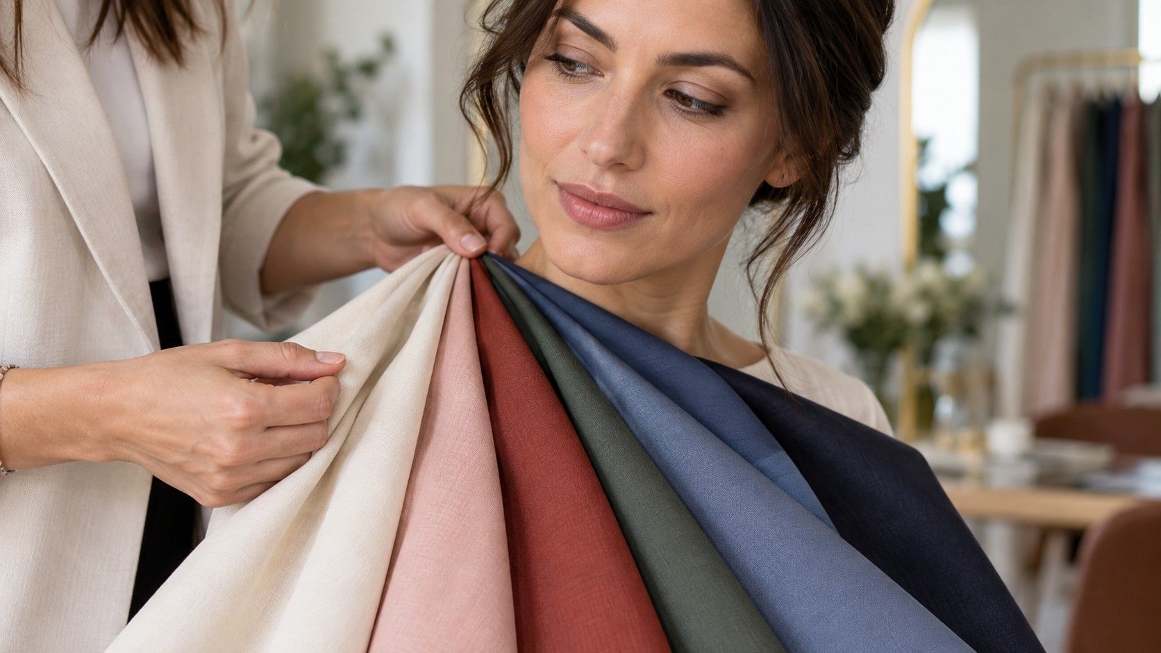
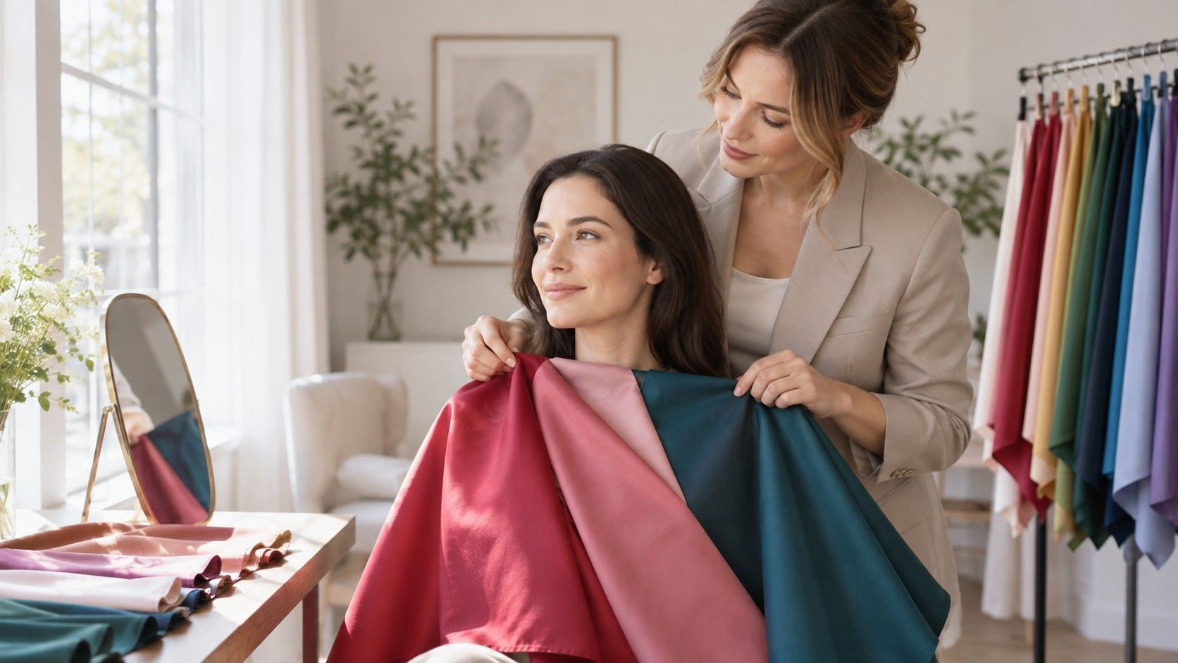
Fabric is usually more useful than veins because the decision you need to make is about color next to your face. Find an ivory or creamy white item and an optic white T-shirt, towel, or sheet. Hold one under the chin, step back from the mirror, then switch without changing position. Keep the fabric smooth enough that wrinkles and shadows do not become the most visible thing. A friend can take the photos, but make sure exposure is locked so the phone does not brighten one test and darken the other.
On many warm undertones, ivory can make the skin look settled and the lips a little more defined, while optic white can look stark or pull yellow from the complexion. Cool undertones may find that optic white makes the face look fresh, while ivory can make it seem slightly dull or yellowed. Neutral undertones may handle both, though usually one is still better when the fabrics are paired with their best makeup and hair colors. Olive complexions can surprise people here: a softened white may look better than either a creamy yellow-white or a very blue-white.
| Result near your face | Possible direction | Next comparison |
|---|---|---|
| Ivory smooths redness; optic white feels harsh | Warm or warm-neutral | Tomato red versus raspberry |
| Optic white brightens; ivory adds yellow | Cool or cool-neutral | Blue-red versus orange-red |
| Both whites work, with small differences | Neutral or flexible coloring | Compare depth and brightness |
| Both look odd, but muted shades work | Olive or low-saturation coloring | Soft white versus mushroom |
Do the test twice, several days apart. A poor night’s sleep, a sunburn, or a flare of redness can distort what seems flattering. The better fabric does not erase your face; it makes the skin look more even and the eyes easier to see. If the shirt itself becomes the main event, it may simply be too bright or too high-contrast, which is a separate issue from temperature.
Let gold and silver add evidence, not pressure
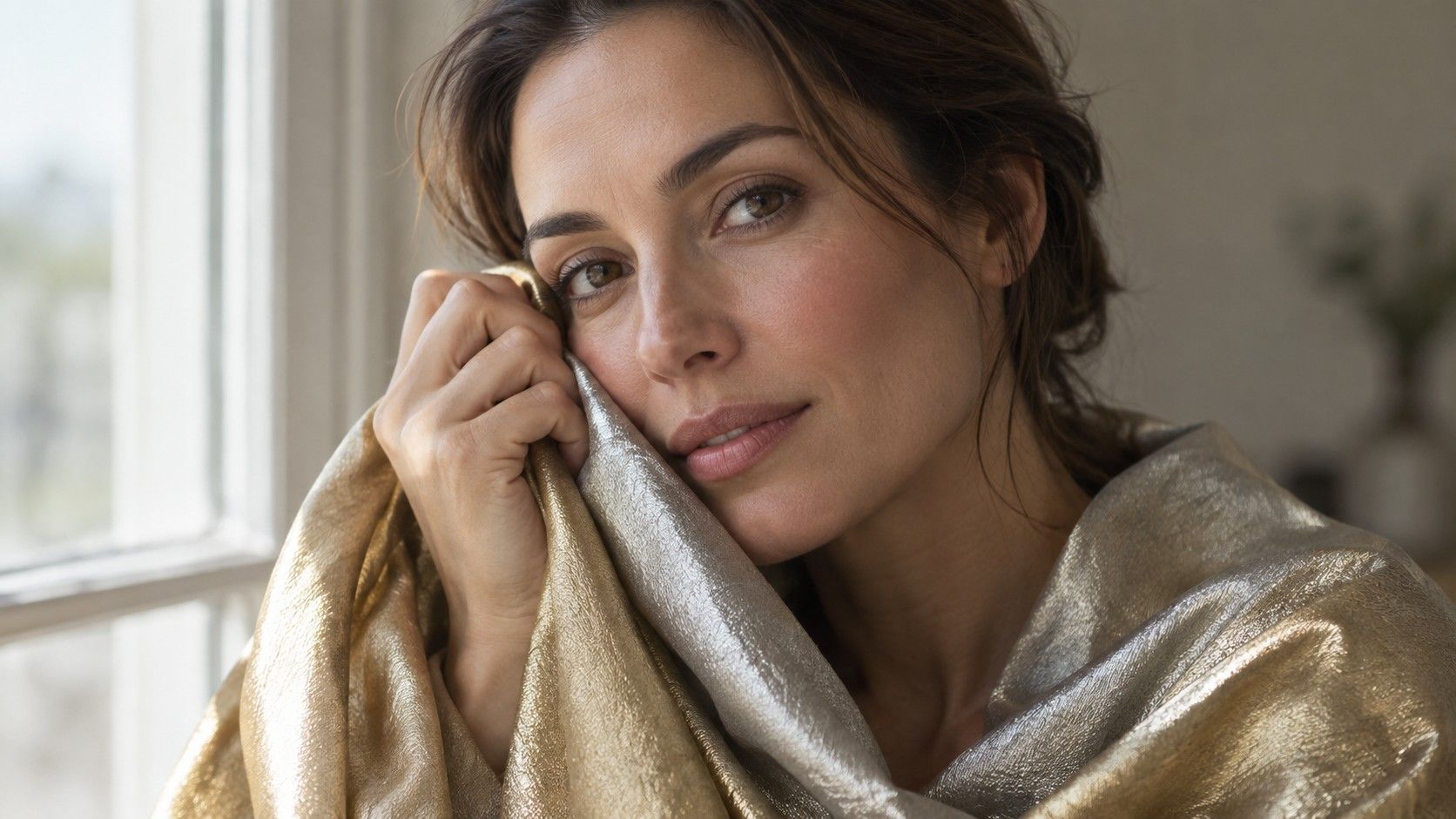
The jewelry test can be satisfying because the difference is visible at a glance, but it has many moving parts. Compare plain, similar-sized pieces: a simple silver-colored hoop or chain and a simple yellow-gold one. Avoid gemstones, rose gold, chunky statement shapes, and highly reflective finishes at first. Hold them against the jaw or collarbone rather than judging from a hand held far from the face. The question is whether the metal makes the skin appear coherent, not whether you prefer the metal as an object.
Gold often sits naturally with warm undertones and silver with cool ones. But neutral undertones can wear both, and contrast can change the outcome. A delicate silver necklace may look better than a heavy gold chain on a warm person because its scale is less distracting. Likewise, a cool-toned person might love aged brass with a dark green stone because the overall color combination is harmonious. This is why a single jewelry result should not overrule fabric tests.
Watch for small signals: does one metal make the under-eye area look shadowed, make the neck look yellow, or bring out redness? Does the other make your features look more defined without demanding attention? Take a short walk to a window, then look again after ten minutes. Eyes adapt quickly, and the first dramatic impression can fade. The metal that still looks quietly right after the novelty disappears is more informative.
Read mixed results without forcing a category
Mixed signals are normal. You might have veins that look green, prefer silver jewelry, and look better in berry than coral. That combination does not mean you failed the test. It can indicate neutral-cool coloring, olive undertone, a difference between your skin and hair contrast, or simply weak evidence from the vein check. Give the most weight to face-level fabric comparisons in reliable daylight, then to repeated makeup and clothing results. Give the least weight to hand veins and internet filters.
Olive undertones deserve particular patience. They may appear yellow-green, gray-green, or neutral depending on lighting and can be warm, cool, or neutral underneath. Many olive-toned people find that extreme orange, powdery pastel pink, and very yellow cream are less successful, while softened teal, muted berry, eucalyptus, plum, or deep neutral colors look unusually steady. That is not a universal olive palette; it is a reason to compare muted and clear versions of the same hue before deciding.
Keep a tiny evidence list for two weeks. Write down what happened when you wore a white top, a favorite red, gold, silver, and a warm versus cool lipstick. Compliments are not the only data, because people sometimes notice novelty rather than harmony. More useful is whether you stop checking your reflection, whether your foundation seems easier to match, and whether an outfit still looks balanced in a cafe mirror after daylight has gone. Repeated ease is a better signal than one spectacular photo.
Turn the answer into better color choices
Once you have a likely direction, use it as a filter rather than a rulebook. If your results lean warm, test cream, warm navy, olive, tomato, coral, and cognac against your face. If they lean cool, start with soft white, blue-red, berry, charcoal, cool navy, and blue-green. If they lean neutral, compare both families at medium intensity and notice which versions remain calm: neutral does not mean every color is equally easy. Depth and brightness still matter.
Makeup offers a fast practical test. Instead of buying several foundations, test two lip colors at the counter or with samples: a warm brick versus a cool berry, for example. Wipe each away fully between attempts and look in natural light. The right temperature often makes bare skin look more even; the wrong one can exaggerate darkness around the mouth or make teeth look less bright. This is not about hiding your natural coloring. It is about seeing which nearby colors support it.
If you are still asking what is my undertone?, leave the category slightly open and make decisions from the comparisons that have already worked. You do not need an official certificate to choose a better white shirt or a more useful blush. A dependable skin undertone test is one you can repeat, explain, and update when your hair, tan, glasses, or preferences change. That small amount of uncertainty is not a weakness; it keeps the result connected to real life.