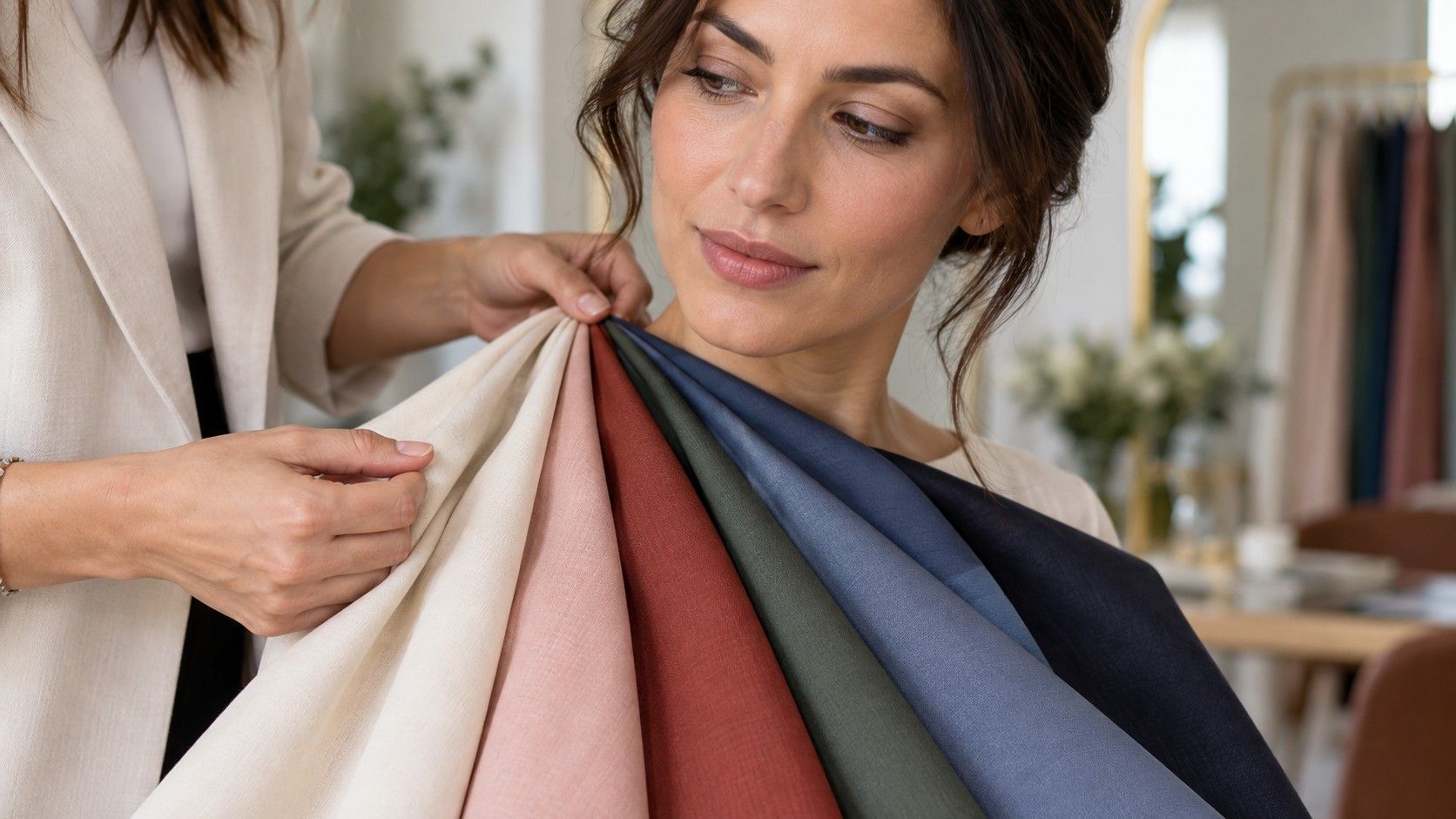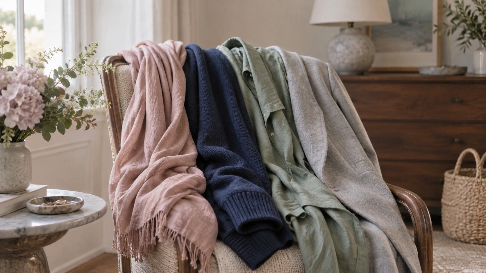
Soft Summer is less about owning a pile of lavender clothes than recognizing a certain visual volume: cool-leaning colors with the brightness turned down. The palette is often described as dusty, smoky, or blended. Those words can sound vague until you compare a clear cobalt sweater with soft navy, or a sharp hot pink with a muted rose. One may appear to wear you; the other lets your face stay visible.
The visual signature of Soft Summer
Soft Summer coloring usually reads as low to medium contrast. Hair, skin, and eyes may not be identical in depth, but the differences between them are gentle rather than dramatic. Ash brown hair, muted blue or gray-green eyes, and skin that reacts well to cool-soft colors are familiar examples. None of these traits is a requirement. The useful clue is what happens when a very bright or very warm color comes near the face: it often looks louder than the features it surrounds.
Muted does not mean washed out. A Soft Summer palette still contains depth in charcoal, soft navy, mulberry, and smoky teal. The common mistake is to replace every clear color with beige. Beige can be difficult for cool coloring, especially when it is yellow or orange based. The more reliable direction is a color with gray in it: rose with a little smoke, blue with a little slate, green with a little blue. These shades have presence without demanding a high-contrast face.
Colors that tend to harmonize in real wardrobes
Dusty rose, mauve, muted raspberry, soft plum, lavender-gray, blue-green, smoky aqua, and soft navy are natural places to start. Notice that these are not merely “cool colors.” They are cooled and softened. A pure royal blue may be cool but too clean; a muted cornflower or slate blue can be easier. The same goes for green: bright spring leaf green often clashes, while eucalyptus, sage with a blue cast, or muted pine is more likely to settle into the overall coloring.
Try the colors in pairs near a window. Hold clear fuchsia beside muted berry, stark white beside soft white, or orange coral beside dusty rose. The more compatible choice generally makes uneven tone and under-eye shadow less obvious. It also makes it easier to see the eyes without using strong makeup. This kind of comparison is better than buying a color because it appears in a seasonal palette graphic; screens make muted shades look darker or more saturated than fabric does.
Choose neutrals that look intentional, not timid
Soft navy is often more useful than black for this palette. It gives depth to trousers, coats, and knitwear without the severe edge that black can add around a low-contrast face. Charcoal, mushroom taupe, cool cocoa, dove gray, soft white, and muted denim make good supporting neutrals. The right neutral should not make the skin look yellowed or disappear into the hair. This is why an unexamined “capsule wardrobe” of camel, cream, and black can be frustrating for a Soft Summer person.
In a fitting room, compare black with charcoal and cream with soft white before declaring one a staple. If black makes the eyes look sharper and the jaw more defined, it may still work, especially with a berry lip or a patterned scarf. If it seems to arrive in the room first, reserve it for shoes, bags, or trousers farther from the face. A neutral is not objectively flattering or unflattering; its usefulness depends on placement, texture, and how much contrast the rest of the outfit creates.
| When a color feels wrong | Try this Soft Summer alternative | Reason to compare |
|---|---|---|
| Bright white looks hard | Soft white or pearl gray | Reduces sharp contrast near the face |
| Black feels severe | Soft navy or charcoal | Keeps depth without the stark edge |
| Clear coral is overpowering | Dusty rose or muted raspberry | Maintains color with less warmth |
| Emerald looks too vivid | Smoky teal or blue-green | Matches a lower-saturation palette |
Hair and makeup choices that keep the palette coherent
Soft Summer hair color usually looks most natural when it stays within a cool or neutral-ash direction. Ash brown, mushroom brown, muted dark blonde, and carefully blended cool highlights often support the same gentle contrast as the clothes. Very golden balayage can make the face look oddly gray by comparison; very black dye can create contrast that asks for stronger makeup every day. This does not mean no warm note is allowed. A subtle beige highlight may work better than an obvious stripe of honey.
For makeup, look for rose, mauve, soft berry, and cool pink rather than bright orange coral or sharply yellow nude. A blush should look like a quiet flush, not a separate color event on the cheek. Brown eye products can be more successful when they are taupe, gray-brown, or plum-brown instead of red-orange. Test in daylight after a few minutes, since warm store lights make almost every bronzy product look more plausible than it will at noon.
How Soft Summer differs from Cool Summer
Cool Summer, sometimes called True Summer, usually tolerates more clarity and visibly cool color. Icy pink, clear periwinkle, cool blue-red, and crisp navy may look lively on that palette. Soft Summer sits closer to muted Autumn influence, so it often needs less brightness and can handle a little more softness in taupe, rose-brown, and smoky green. Both groups may reject obvious orange, but they do not need identical versions of blue, pink, or gray.
A practical test is to compare a clear cool shade with a softened cool shade at the same depth. Put crisp cobalt beside slate blue, or clean bubblegum pink beside muted rose. If the clearer color defines your features without taking over, Cool Summer may be worth exploring. If the softened version makes the skin look steadier and the whole face more composed, Soft Summer is the stronger direction. Do not base the decision on one good lipstick; fabric reflects far more color onto the face.
Use the palette without becoming afraid of color
Build from what already succeeds. Pull out the shirts, scarves, and makeup shades that make you feel pulled together on an ordinary morning. You may find a pattern of softened blues, rosy neutrals, and medium-depth colors before you ever buy a swatch fan. Add three dependable neutrals and a few accent colors, then wear them in different weather. A cloudy day can be particularly revealing because it removes the false warmth that makes difficult colors temporarily charming.
Soft Summer is a tool for editing choices, not a ban on favorite shades. A bright color can work in a print, on the lower half, or as a small accessory. A black dress can work with a softer scarf, makeup, or a low-contrast jacket. The palette earns its keep when it helps you recognize why some options need extra effort and others make your features look quietly clear without much adjustment.