The question “what colors look good on me?” sounds as if there should be one tidy answer and a color wheel that settles it. Real wardrobes are less obedient. The colors that suit you depend on what happens near your face: undertone, depth, contrast, and how much intensity your features can carry. The useful part is that you can test all of those without turning your closet into a research project.
Start with the colors that sit closest to your face
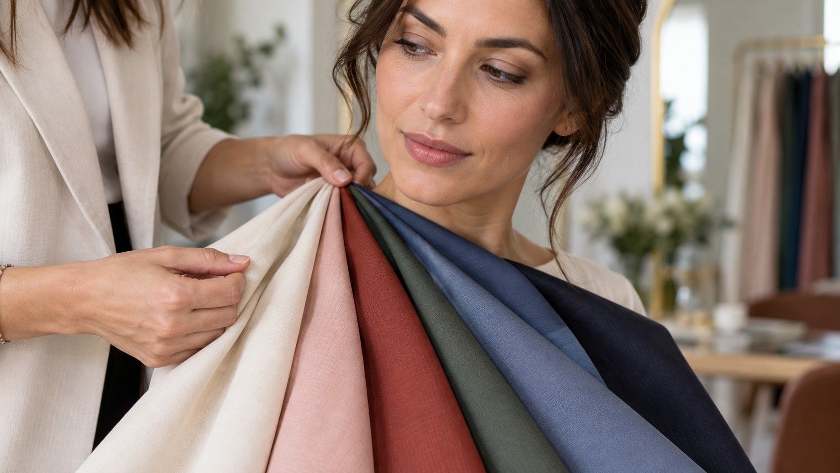
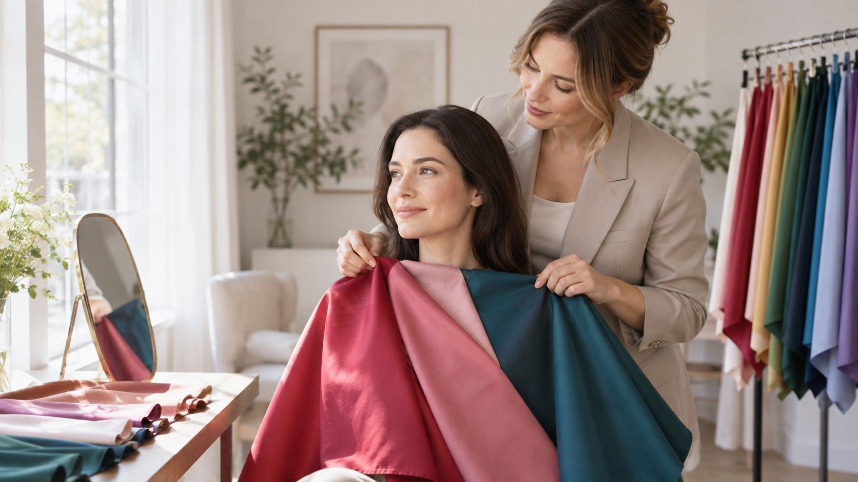
A skirt in an odd shade can be saved by shoes; a sweater, scarf, collar, or lipstick has nowhere to hide. Begin with these near-face colors because they show whether the skin looks clear, dull, yellowed, or suddenly overemphasized. Stand by a window with a clean mirror and remove tinted glasses. If possible, test before doing a full face of makeup. Corrector and contour can disguise the very reactions you are trying to notice.
Pay attention to the areas that are easy to overlook when you are checking whether an outfit feels “nice”: under the eyes, around the mouth, and across the jaw. A good color does not need to make you glow like an advertisement. It often makes the face look more settled, as though you slept well. A difficult color can be beautiful in isolation yet bring out shadow, redness, or a sallow cast the moment it is under your chin.
Warm, cool, and neutral are directions, not handcuffs
Undertone is a useful starting point because warm yellows, cool blues, and balanced neutrals tend to interact differently with skin. Someone who looks fresh in soft cream, olive, and tomato may find icy lilac harsh. Someone who comes alive in berry, charcoal, and blue-red may find camel oddly draining. Still, skin tone has surface changes: a tan, rosacea, or a red winter nose can make the surface look warmer than the underlying coloring.
Neutral coloring is especially easy to misread. It does not mean every color is equally successful. It often means you can borrow from both sides when the shade is softened or adjusted in depth. Rather than declaring yourself warm because gold jewelry looked good once, compare pairs that are close in value: ivory against crisp white, coral against dusty rose, moss against teal. The comparison gives your eyes something concrete to judge instead of asking them to interpret a label.
Use contrast to decide how strong a color should be
Contrast is the distance between your hair, skin, and eyes. High-contrast features can often carry clear black and white, vivid jewel colors, or sharp color blocking without the clothes taking over. Low-contrast features may look more coherent in smoky blue, mushroom, soft navy, and blended prints. This is not a rule about personality or confidence; it is an observation about how much visual separation already exists in the face.
Try a simple black-versus-soft-charcoal check. If black makes your eyes look brighter and your features more defined, you may tolerate stronger depth. If it reaches the room before you do, charcoal or deep navy may be a better dark neutral. Repeat with a bright red and a muted berry, or a crisp optic white and a gentle off-white. These pairs reveal saturation and depth more quickly than a dozen unrelated tops on a rack.
| If this happens near your face | Try this direction | Compare it against |
|---|---|---|
| Bright color appears before your face does | Muted or medium-saturation shades | Dusty teal versus clear turquoise |
| Soft colors make features disappear | Deeper or cleaner color contrast | Ink navy versus washed denim |
| Black feels severe but beige feels flat | Middle-depth neutrals | Charcoal, cocoa, soft navy |
| Warm and cool shades both partly work | Balanced, softened colors | Muted berry, eucalyptus, taupe |
Run a dressing-room test instead of trusting the hanger
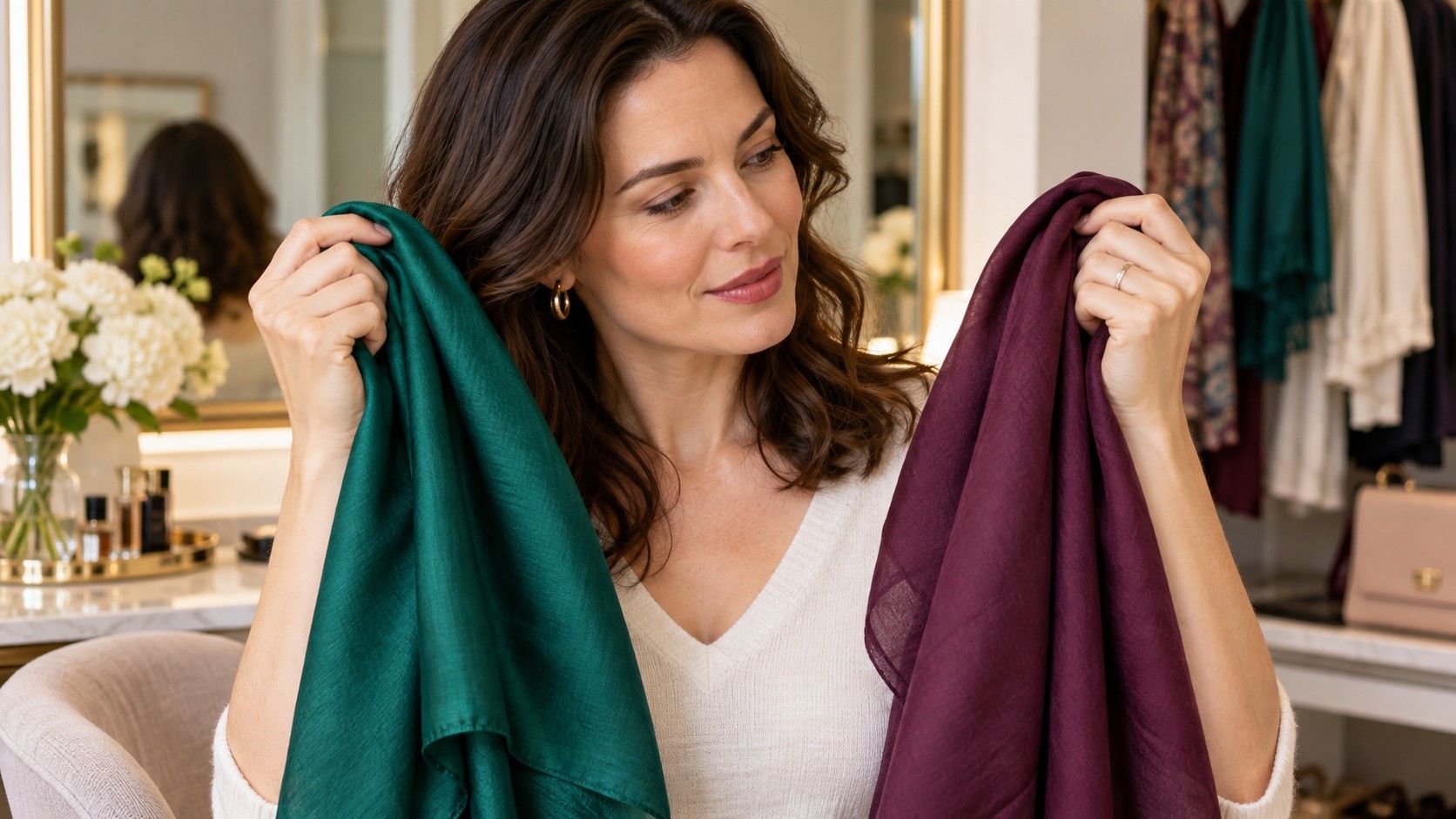
When you are shopping, take two versions of the same family into the fitting room: a cool raspberry and a warm coral, a golden olive and a blue-green teal, a cream and a white shirt. Hold each up with the same lighting and photograph them if the mirrors are unreliable. Department-store lighting can be aggressively warm, so check the photos later near a window before removing tags. A color that feels exciting under spotlights may look strangely yellow at breakfast.
Keep the rest of the comparison plain. Use the same jeans, no dramatic necklace, and hair pulled away from the face if it is long enough to cast a shadow. Looking at one top after another is less useful than alternating the pair several times. Your eye adapts quickly, especially to saturated colors. The better choice will usually keep working after the first impression fades, while the weaker one starts asking for stronger lipstick or extra concealer.
Do not let eye color or hair color make the whole decision
Eye color is a detail, not the boss of the palette. Blue eyes can look wonderful beside rust, plum, navy, or charcoal; brown eyes can be sharpened by green, rose, or cobalt. Choosing every garment to “match” the eyes often produces a narrow closet and ignores the skin, which occupies far more of the visual field. Instead, use eye color as a small accent clue after the near-face color already works.
Hair color deserves a similar amount of respect. A dramatic dye change can alter your apparent contrast enough that formerly easy colors need revisiting. But it does not rewrite your undertone. If your natural coloring looked harmonious in muted blue-green, you may still prefer that direction after highlights; you might simply need a clearer version to balance the new hair. Test a few trusted colors before buying a whole replacement palette because a salon mirror made one shade look cinematic.
Build a useful palette from clothes you already wear
Open the part of your closet that gets worn, not the part containing aspirational purchases. Pull out five pieces that repeatedly earn compliments or make getting dressed easy. Look for their shared qualities: perhaps they are all medium-dark, slightly muted, and neither very warm nor very cool. Then identify two colors that often remain unworn even though you admire them on other people. This is better evidence than an online quiz because it includes your real lighting, lifestyle, and comfort level.
From there, choose three reliable near-face neutrals, four accent colors, and one bolder option for days you want more presence. A palette should make combinations easier, not forbid spontaneity. If you wonder what colors suit me for a specific event, use the same process: choose a color that clears the face first, then adjust the silhouette and accessories. You do not need permission from a seasonal label to wear a color that consistently makes your features look awake.
Give the result a few ordinary days before calling it final
Test promising colors on a workday, a cloudy day, and an evening when indoor light is doing its usual unhelpful thing. Notice whether you reach for different makeup, whether photographs need less editing, and whether the garment still looks right when your hair is not freshly styled. These ordinary checks catch the difference between a fun mirror moment and a color that belongs in your life.
Your personal colors can also expand with context. A shade that is too strong as a sweater may work as a bag, trouser, nail color, or print. A difficult pastel may be fine when separated from the face by a jacket. The aim is not to turn “what are my colors?” into a restrictive test. It is to recognize the choices that make you look like yourself, only less visually tired.