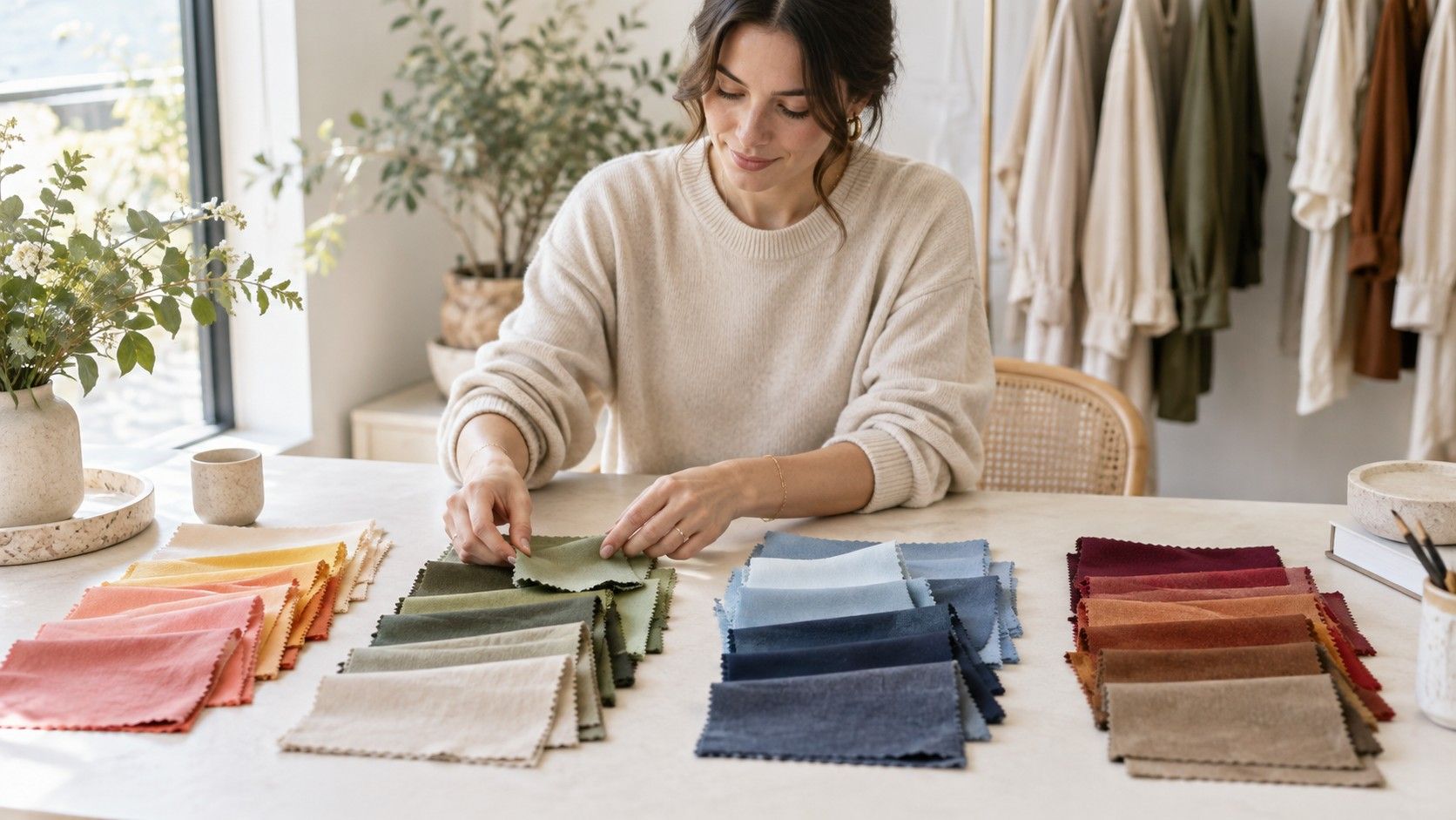
When people ask what season am I, they usually want a wardrobe answer, not a new identity. They want to know why cream looks better than stark white, why a certain red makes their face look lively, or why black feels either effortless or exhausting. The four-season system gives those reactions a useful structure, provided you use it as a series of comparisons rather than trying to guess a label from hair and eye colour alone.
What a color season is designed to describe
A color season groups shades that share a similar temperature, value, and chroma. Temperature is the warm or cool direction. Value is how light or deep a color is. Chroma describes whether it is clear and bright or softened with grey and brown. Spring, Summer, Autumn, and Winter are simply four memorable ways to combine those qualities. They are not four boxes that contain every possible person.
The practical test is always near the face. A color can be beautiful on a rail and still pull attention toward shadows, redness, or the garment itself. A more harmonious color makes the face easier to see. The jawline may look cleaner, the eyes clearer, and small differences in skin tone less distracting. This effect is often subtle, which is why a careful fabric comparison teaches more than a fast color season test.
Seasonal color analysis works best when it reduces repeat mistakes. If you learn that dusty, cool blues consistently suit you better than bright turquoise, you can make quicker choices even before you know whether your final label is Summer or Soft Summer. The season is useful shorthand. The evidence is the set of colors that repeatedly work in daylight.
Start by testing temperature, not by studying veins
The first broad split is between warm seasons, Spring and Autumn, and cool seasons, Summer and Winter. But temperature is not the same as complexion depth. Pale skin can be warm; deep skin can be cool; many people sit close to neutral. Vein color, jewellery preference, and whether you burn in the sun can offer clues, but each is easily distorted by lighting, personal taste, and skin thickness.
Instead, use paired drapes. Compare cream with pure white, coral with blue-red raspberry, camel with cool taupe, and moss with blue-grey. Keep the fabrics at a similar lightness so you are changing one main variable at a time. Stand beside a window with overhead lamps off. The better temperature often makes the skin look more even without appearing to add colour to it.
Do not expect every pair to give a dramatic answer. A neutral person may look reasonable in both cream and white, but better in a softened version of one. A warm person may dislike orange despite responding well to warm olive and tomato red. This is why which season am I is a better question after a few side-by-side tests than before them.
| Comparison | Likely warm response | Likely cool response |
|---|---|---|
| Cream and white | Cream settles the face | White makes features look clearer |
| Coral and raspberry | Coral looks lively without glare | Raspberry reduces yellow or dullness |
| Camel and blue-grey | Camel looks connected to the skin | Blue-grey feels calmer and more even |
Then compare clarity and depth
Once a temperature direction seems likely, look at chroma. Spring and Winter are generally clearer: their colors have an unmuddied, crisp quality. Autumn and Summer are softer: their best shades contain more grey, smoke, or earth. A person who looks excellent in faded denim, sage, smoky rose, and soft navy may be overwhelmed by electric blue even when both colors share a cool undertone.
Depth matters too. A light face with light brows and delicate features can disappear under black, espresso, or very dark jewel tones. A deep, high-contrast face can make pale beige and washed pastels look unfinished. Try a light neutral, a medium neutral, and a dark neutral close to the face. Notice whether the fabric holds the face together or whether the color arrives first.
Take photographs of two drapes at the same window, then review them later with night mode switched off. Brighter and darker choices often win the first glance because they have more drama. On a second look, the better choice is normally the one where your expression appears before the shirt. Repeat the test another day if sleep, a tan, or a flush could be affecting the result.
The four seasons in plain language
Spring is warm, light to medium in value, and usually clear. Think warm ivory, leaf green, peach, coral, clear aqua, and warm navy rather than heavy black. Spring colors tend to look fresh rather than dusty. A person leaning Spring may find that rusty brown is too muted, while clear tomato red and light warm green give their features a welcome lift.
Summer is cool and soft, often light to medium in depth. The palette includes dove grey, soft navy, rose, lavender, smoky blue, and muted teal. Summer is not simply pastel; it can include medium dusty colours as well. If strong black feels severe and bright orange feels disconnected, but soft plum and blue-grey look composed, Summer is worth exploring.
Autumn is warm, soft, and often medium to deep. Olive, moss, terracotta, cinnamon, deep teal, warm cream, and chocolate are common reference points. The important quality is richness without sharpness. An Autumn-leaning face may handle deep earthy colors beautifully yet look worn out beside icy pink, optic white, or an intense cool fuchsia.
Winter is cool, deeper or higher contrast, and clear. Black, charcoal, crisp white, ink navy, cobalt, blue-red, emerald, and cool berry shades often fit the direction. Winter does not mean every person needs dramatic color every day. It means clarity and contrast can support the face. If muted taupe makes you look faded while clean navy and a strong berry lip make your features look organized, Winter may be a useful first stop.
What to do when you sit between seasons
Many people are not a perfect textbook version of one season. You may be cool but deeper than a typical light Summer palette, warm but too muted for clear Spring shades, or neutral enough to borrow from both sides. This does not make the process a failure. It means the four seasons have identified a direction and your next comparisons need more detail.
Keep a small record of results in roles rather than labels: best white, best dark neutral, best red, best pink, best green, and one color that is difficult. If both navy and charcoal work, note which looks better on a tired day. If black works only with eyeliner but ink navy works bare-faced, that is useful wardrobe information. You do not have to resolve every shade before buying one good coat.
A color season test is most reliable when it leads you back to real fabric. Try the winning shades in a shop window, in a car mirror, and at home in daylight. Hair dye, glasses, and makeup can change the visual balance, so revisit the comparisons after a major change. The aim is not to earn a permanent seasonal badge; it is to recognise the color relationships that make getting dressed simpler.